

A bathroom can feel brighter, calmer, and more put together with one smart color choice. The best bathroom paint colors work with the tile, vanity, lighting, flooring, and fixtures already in the room.
Soft greens can feel restful, warm whites keep things light, and deeper blues add rich contrast. The key is finding a shade that works in the actual space, not relying on a tiny paint chip.
The right shade can also help tie together older finishes and newer updates without changing the whole room.
This blog brings together useful color ideas, practical tips, and trusted brand resources. Keep reading to see which bathroom paint colors could work best for different styles.
How to Choose The Right Paint Color for Your Bathroom
Start with the surfaces that will not change, such as tile, flooring, countertops and the vanity. Look closely at their undertones.
Warm beige tile often pairs well with cream, greige, sage and warm white. Cool gray tile can work better with blue, soft gray, or cleaner whites.
Next, check the lighting. Natural light, vanity bulbs, and ceiling lights can make the same shade look different throughout the day.
Test large paint samples beside permanent finishes instead of choosing from a small swatch. Check each sample in the morning and evening.
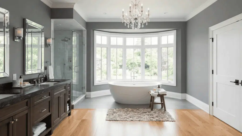
Also think about contrast. Light walls can balance a dark vanity, while deeper walls can give white fixtures more definition.
Best Bathroom Paint Colors to Consider
The colors below cover soft neutrals, calming greens, light blues and deeper shades. Each one works best with certain finishes, lighting and room styles.
1. Warm White
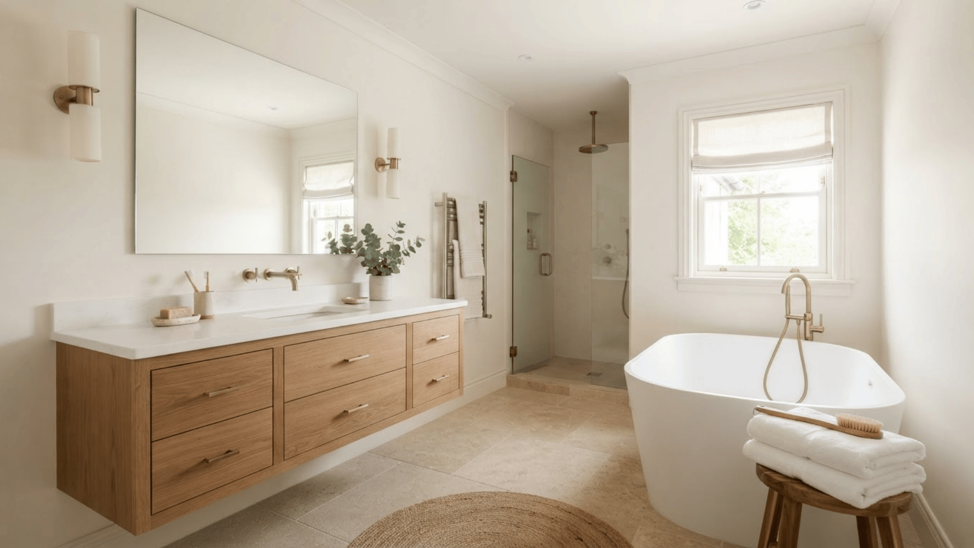
Warm white is a safe choice for bathrooms with beige tile, wood vanities, cream stone or brass hardware.
It keeps the room light without creating the sharp look that some bright whites can have. This color also gives patterned flooring or a statement vanity more space to stand out.
Pair it with soft white trim for a connected look. Before painting, compare the shade with the sink, tub, and toilet because nearby whites can reveal yellow, pink, or gray undertones.
2. Soft White
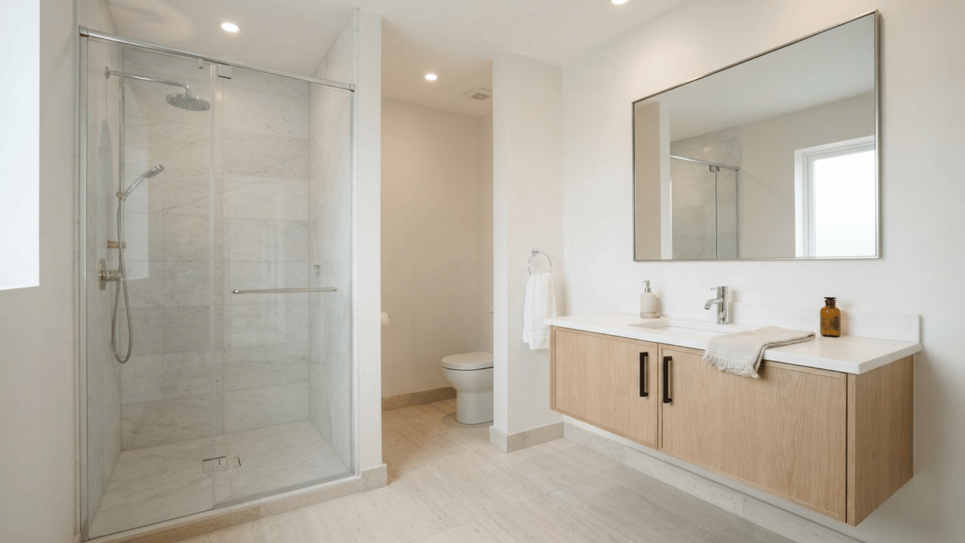
Soft white works well when the bathroom needs a clean background without feeling cold. It pairs easily with marble, light wood, white tile, chrome, and black hardware.
This shade can also help small bathrooms feel less crowded because it doesn’t compete with other surfaces. Use it when the vanity, flooring, or shower already has plenty of color or pattern.
Test several soft whites together, as small undertone differences become much easier to notice once placed beside bathroom fixtures.
3. Cream
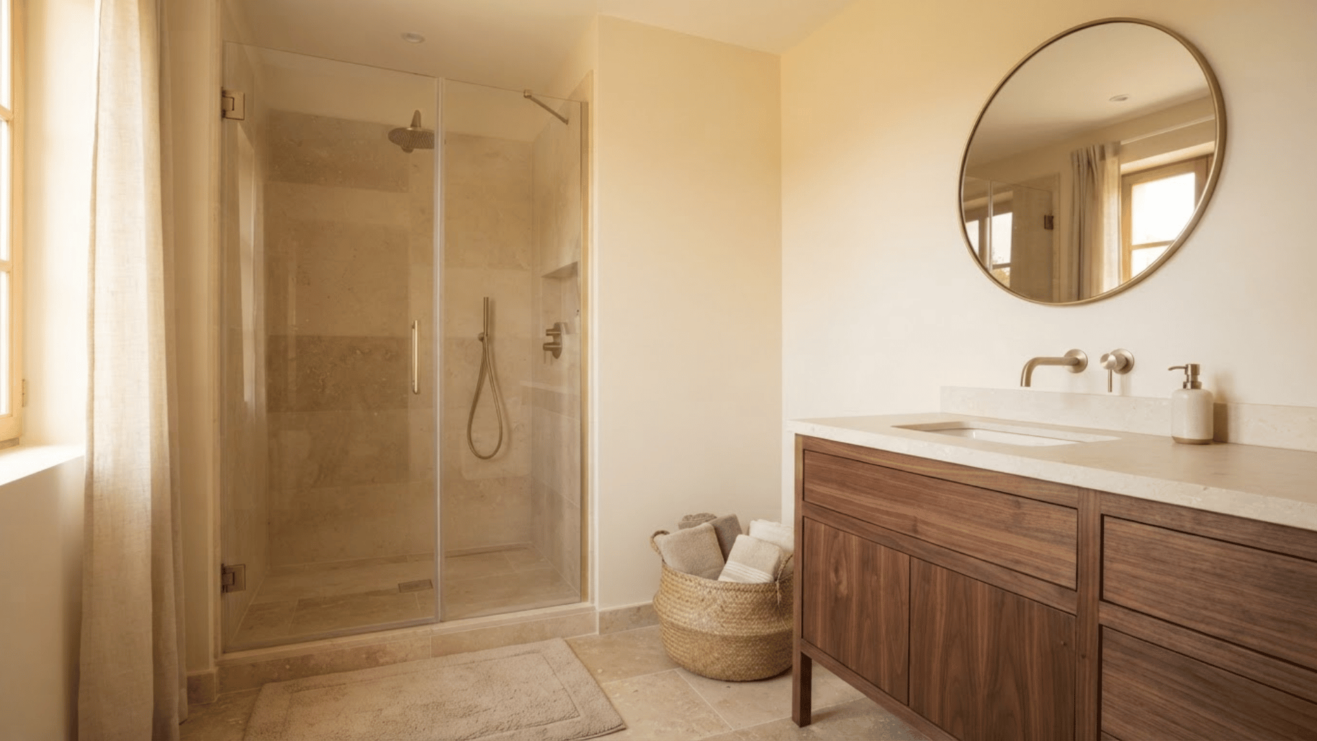
Cream adds warmth to bathrooms and works especially well with beige stone, travertine, natural wood, and warm metals. It can soften rooms filled with tile, glass, mirrors, and other hard surfaces.
Compared with white, cream adds more depth while keeping the overall room light. It suits traditional, farmhouse, and relaxed bathroom styles.
Avoid choosing a cream that becomes strongly yellow under artificial lighting. A large sample placed beside the floor and vanity will show how the shade reacts to the room’s existing tones.
4. Pale Blue
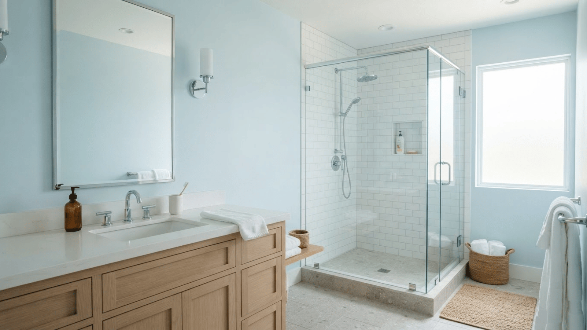
Pale blue can make a bathroom feel light and calm without looking plain. It pairs well with white tile, chrome fixtures, light gray flooring, and pale wood.
The color is useful in bathrooms that need a gentle hint of color but cannot support a darker shade. A pale blue can appear stronger in rooms with cool LED lighting, so sampling matters.
Pair it with warm wood or woven textures if the bathroom starts to feel too cool. White towels can keep the color scheme clean and simple.
5. Blue-Gray
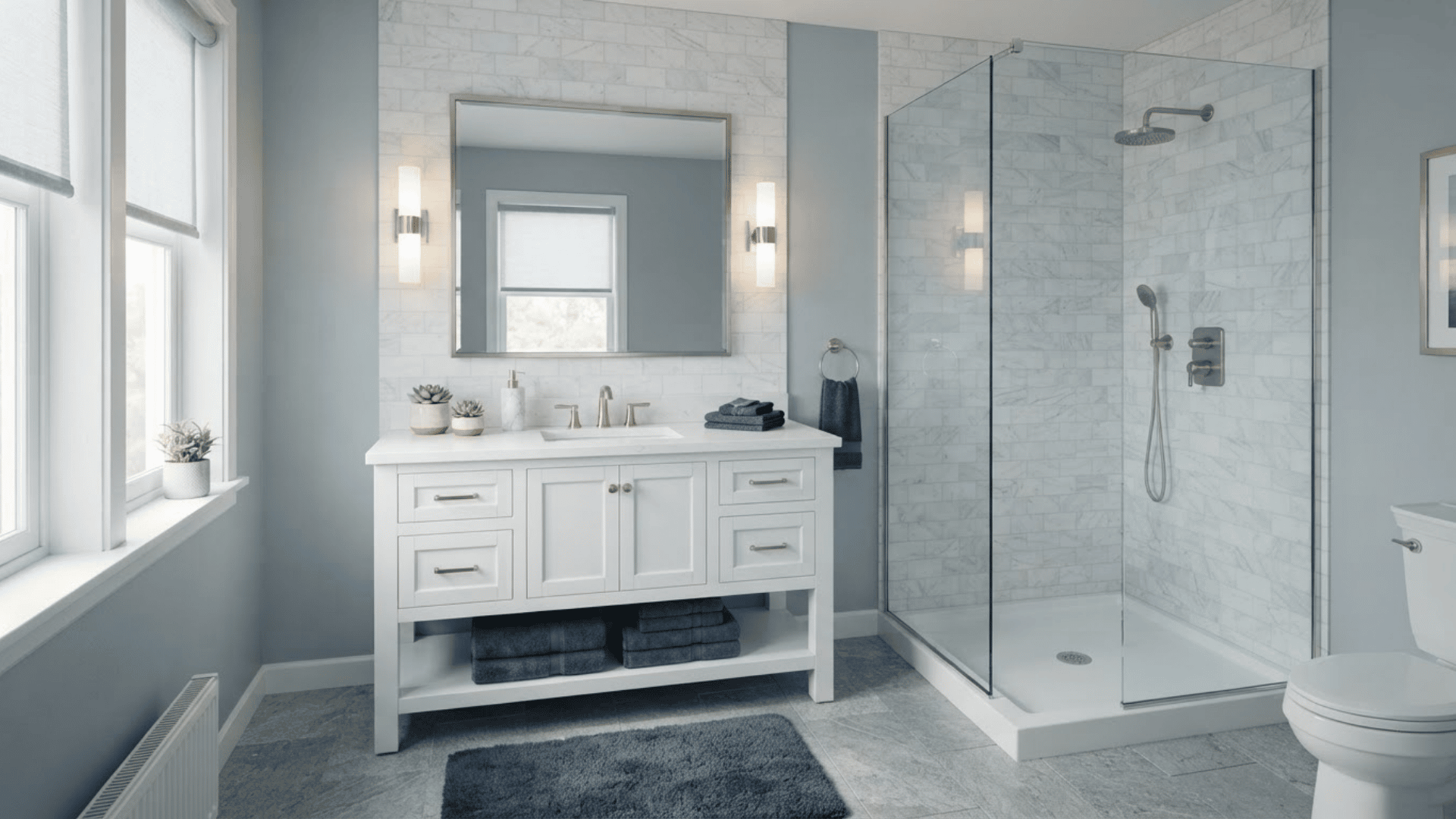
Blue-gray sits between a neutral and a true blue, which makes it easy to use in many bathrooms. It works well beside white marble, cool gray tile, chrome, nickel, and darker blue accents.
This shade can add definition to the walls without becoming the strongest feature in the room. It is also useful when plain gray feels flat.
In rooms with limited natural light, some blue-gray shades can appear much bluer than expected. Check the sample under every main light source before making the final choice.
6. Sage Green
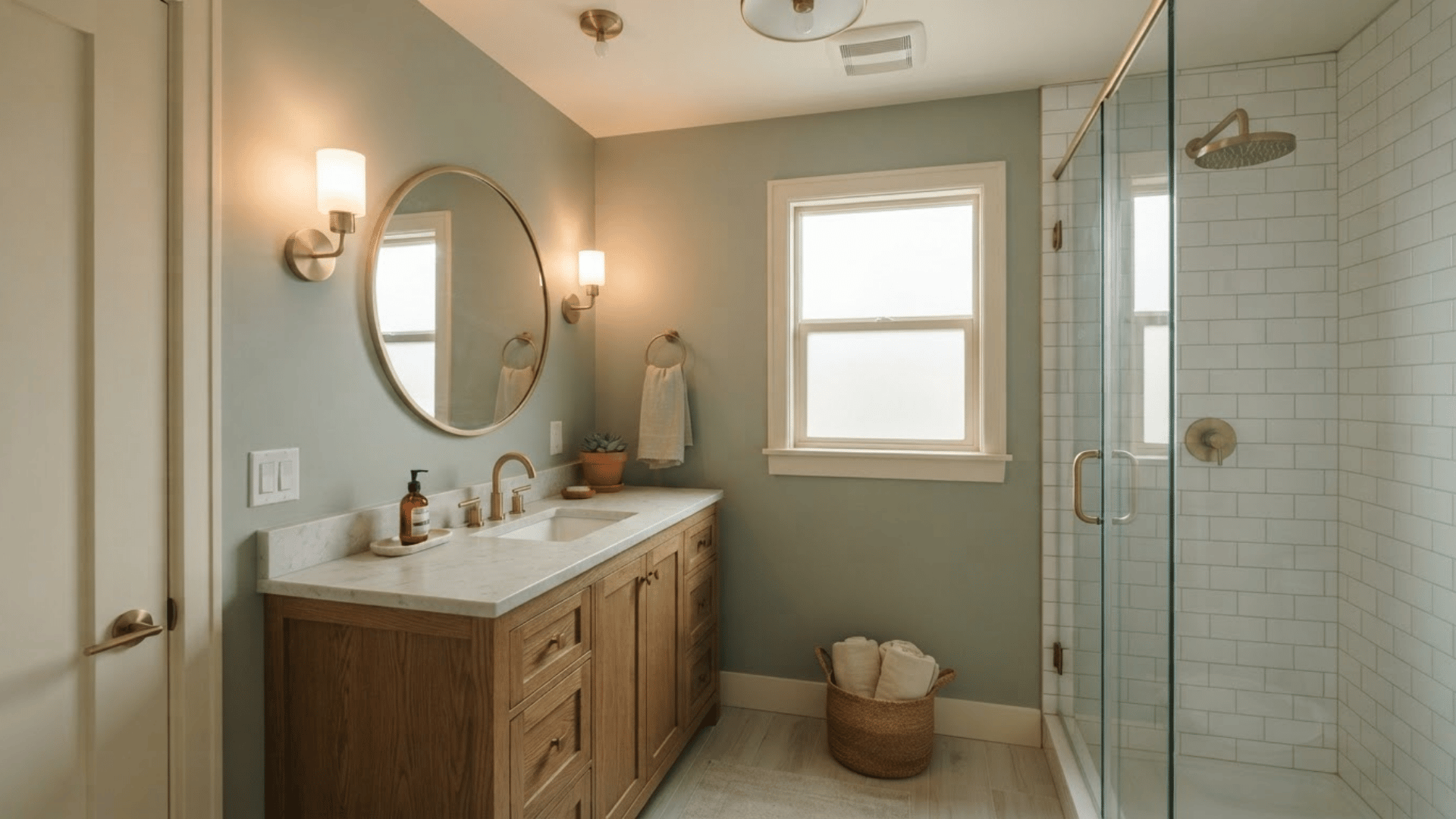
Sage green works naturally with wood vanities, stone countertops, white tile, cream accents, and warm metal finishes.
Its muted character gives the room color without the strength of emerald or forest green. It is particularly useful in bathrooms that include natural textures such as oak, rattan, linen, or stone. Pair it with warm white trim for a softer scheme.
Darker woods can make sage feel richer, while pale woods keep it lighter. Always compare green paint with the tile grout before choosing the final shade.
7. Mint Green
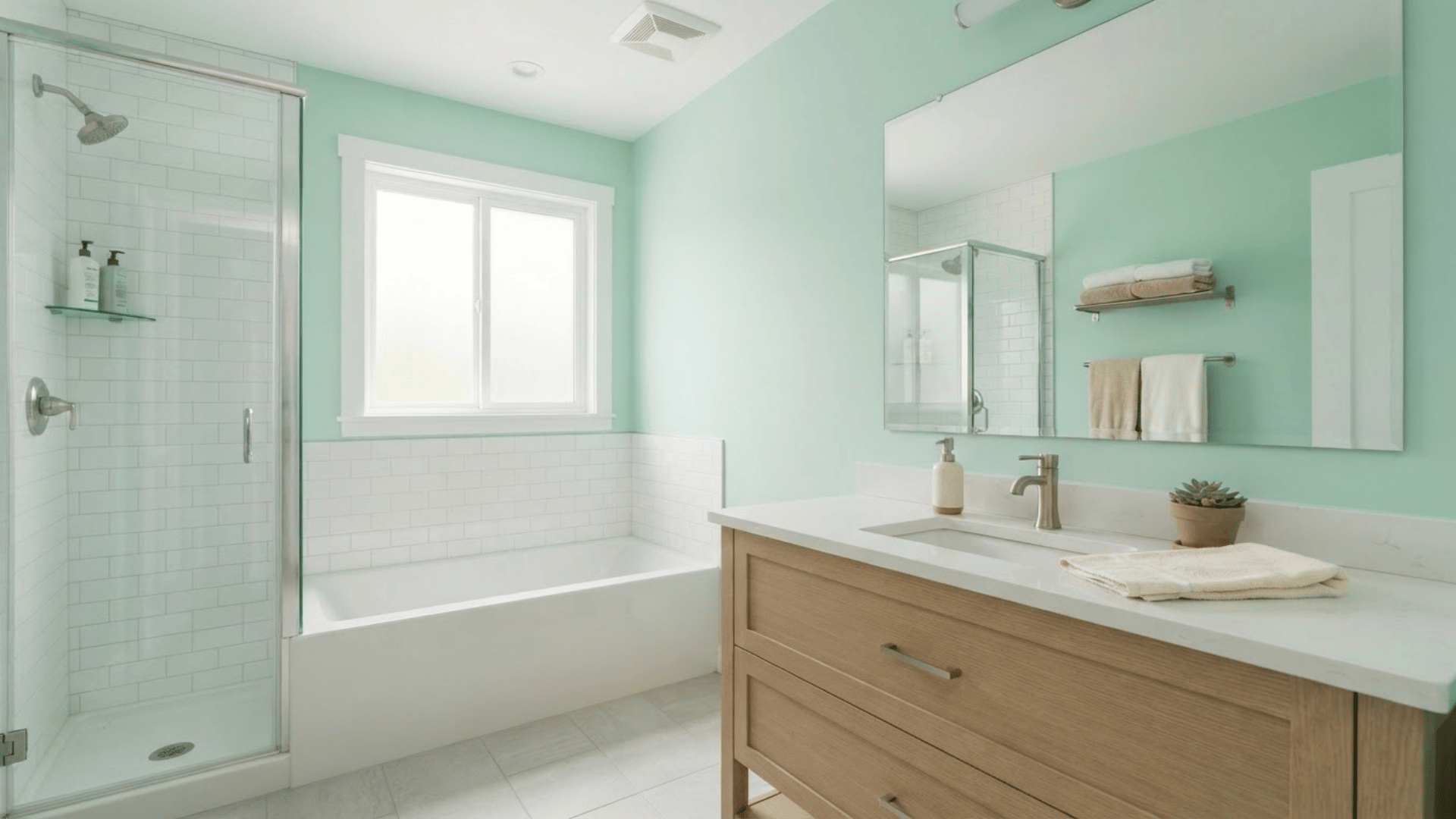
Mint green gives a bathroom a fresher, lighter look than deeper sage shades. It works well with white fixtures, pale wood, simple tile, and light gray floors.
Because mint has a stronger color presence than many neutrals, it can bring life to a bathroom that feels too plain. Keep the rest of the palette restrained if the room is small.
Warm lighting can soften the green, while cool bulbs may make it appear brighter. Test it near mirrors because reflected light can increase the visible color.
8. Green-Gray
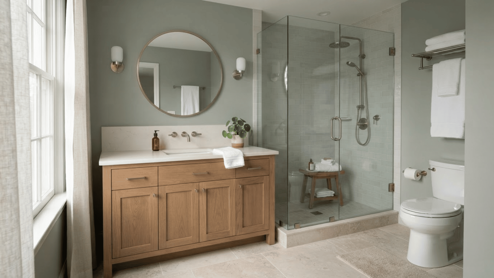
Green-gray is useful for homeowners who like green but want a more muted result. The gray influence keeps the color restrained, making it easier to pair with stone, wood, off-white, and mixed metal finishes.
It can work especially well in bathrooms where the tile already contains subtle green or gray tones. This shade also provides more personality than plain greige.
Check it beside the countertop and flooring because surrounding colors can pull either the green or gray undertone forward once the walls are fully painted.
9. Light Gray
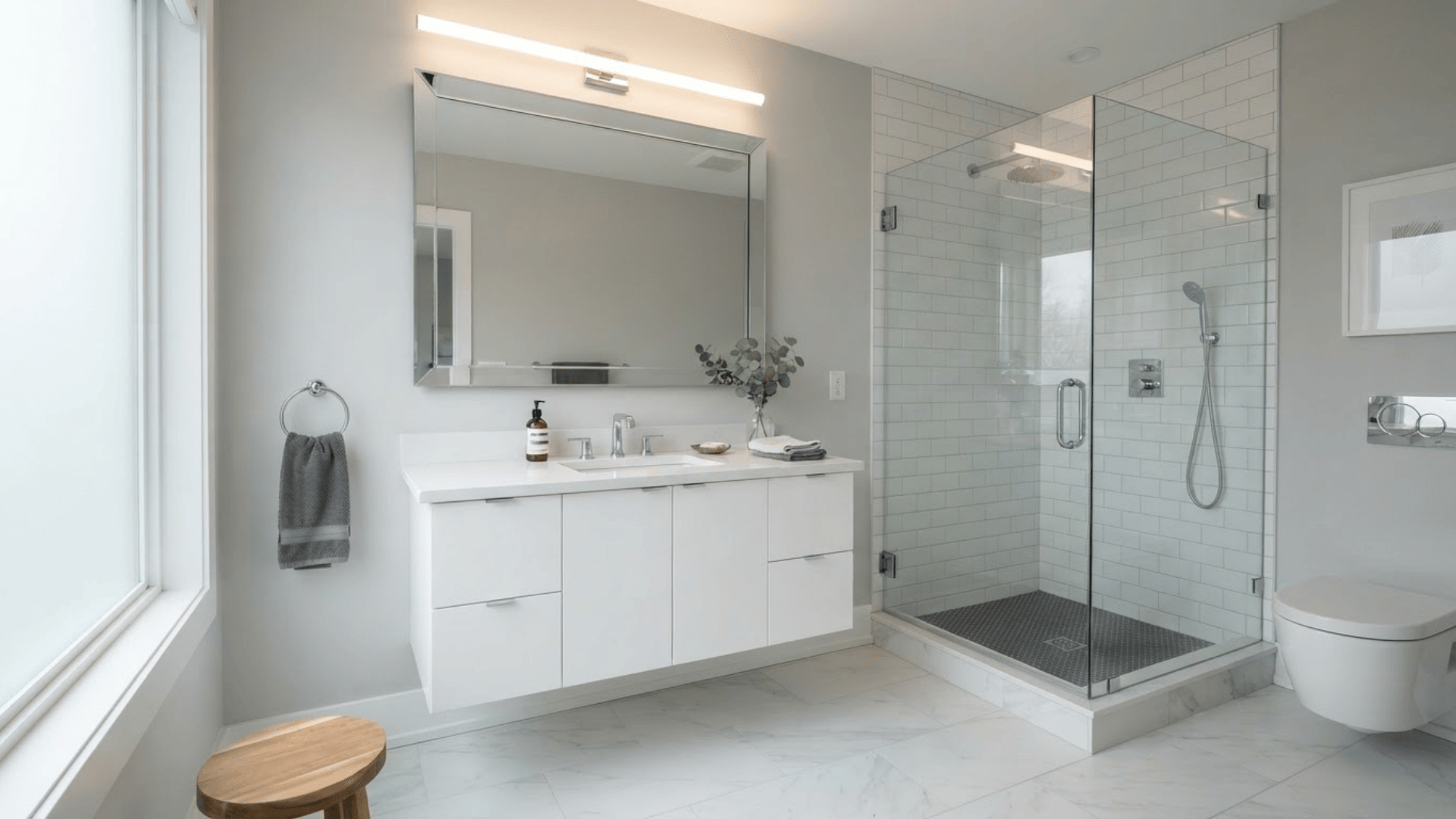
Light gray can add definition without making the space feel dark. It works well with cool white tile, marble, chrome, silver fixtures, and charcoal accents.
This shade works well for modern bathrooms that need a simple, neutral background. Still, gray can shift toward blue, green, or violet depending on the room.
Avoid choosing it without checking the undertone against tile and grout. If the bathroom has warm beige flooring, a cooler light gray may clash, so a warmer gray may be the better fit.
10. Greige
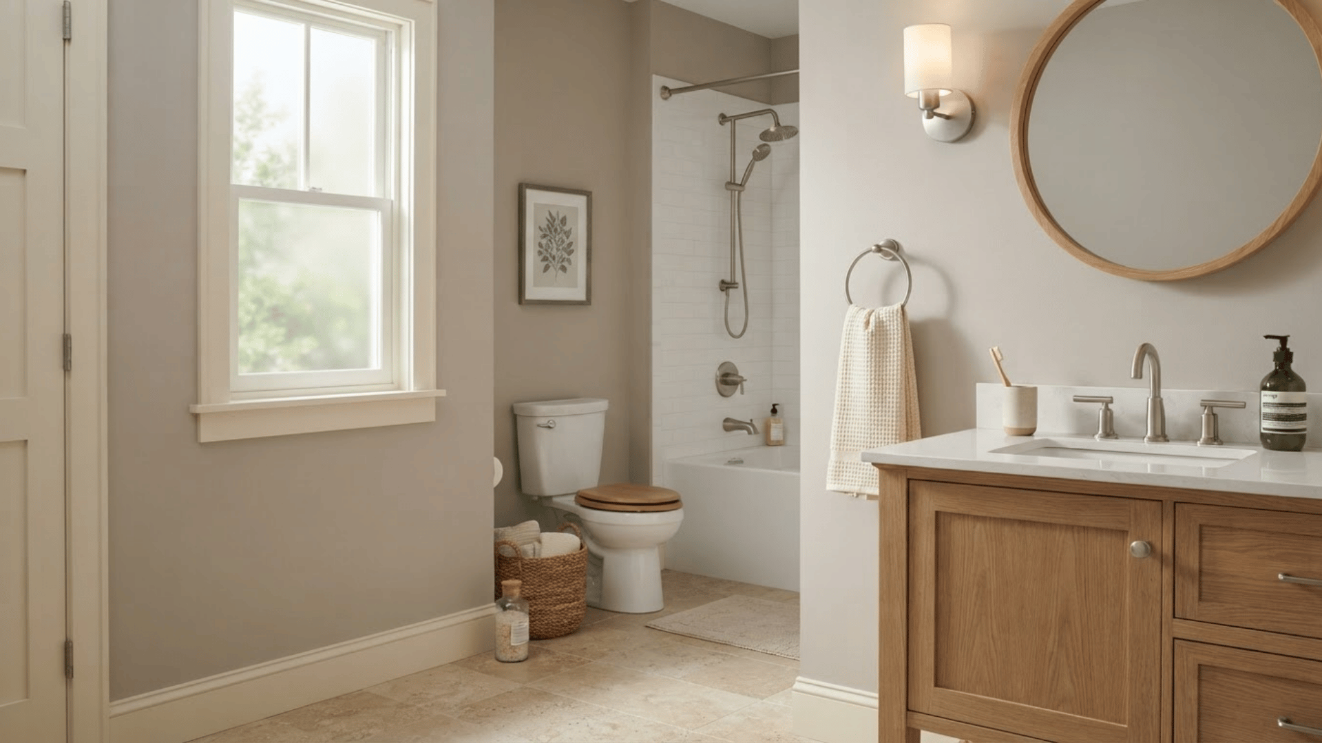
Greige combines gray and beige, making it useful in bathrooms that contain both warm and cool finishes. It can help connect a white tub, beige floor, wood vanity, and brushed nickel fixtures without forcing the room to feel strongly warm or cool.
Greige also works well when pure gray feels too cold, and beige feels too traditional. Pair it with creamy whites, natural wood, or muted green accents.
Since greige can shift significantly under artificial light, test more than one option before choosing the shade for all four walls.
11. Beige
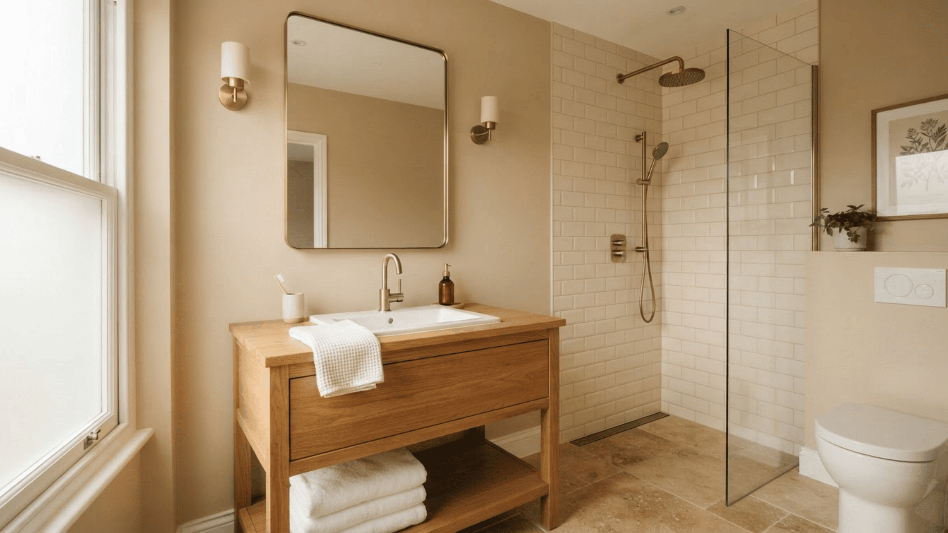
Beige can work well in bathrooms with warm stone, oak cabinetry, brass details, and cream tile. Modern beige shades tend to look softer and less yellow than many older versions.
They give the room warmth while allowing stronger materials, such as patterned stone or wood grain, to remain noticeable.
Beige also works well for creating a low-contrast look when the flooring already contains tan tones. Pair it with white towels or darker hardware for definition. Check the undertone carefully so the walls do not clash with existing tile.
12. Taupe

Taupe brings more depth than beige while staying neutral enough for everyday use. It can contain brown, gray, or slightly violet undertones, so it pairs well with stone, dark wood, cream tile, and warm white trim.
This color suits bathrooms that need warmth without moving into a yellow-based palette. It can also give a powder room a more grounded look.
Since taupe changes noticeably beside different materials, compare samples directly against the vanity, counter, flooring, and shower tile before settling on one version.
13. Soft Pink
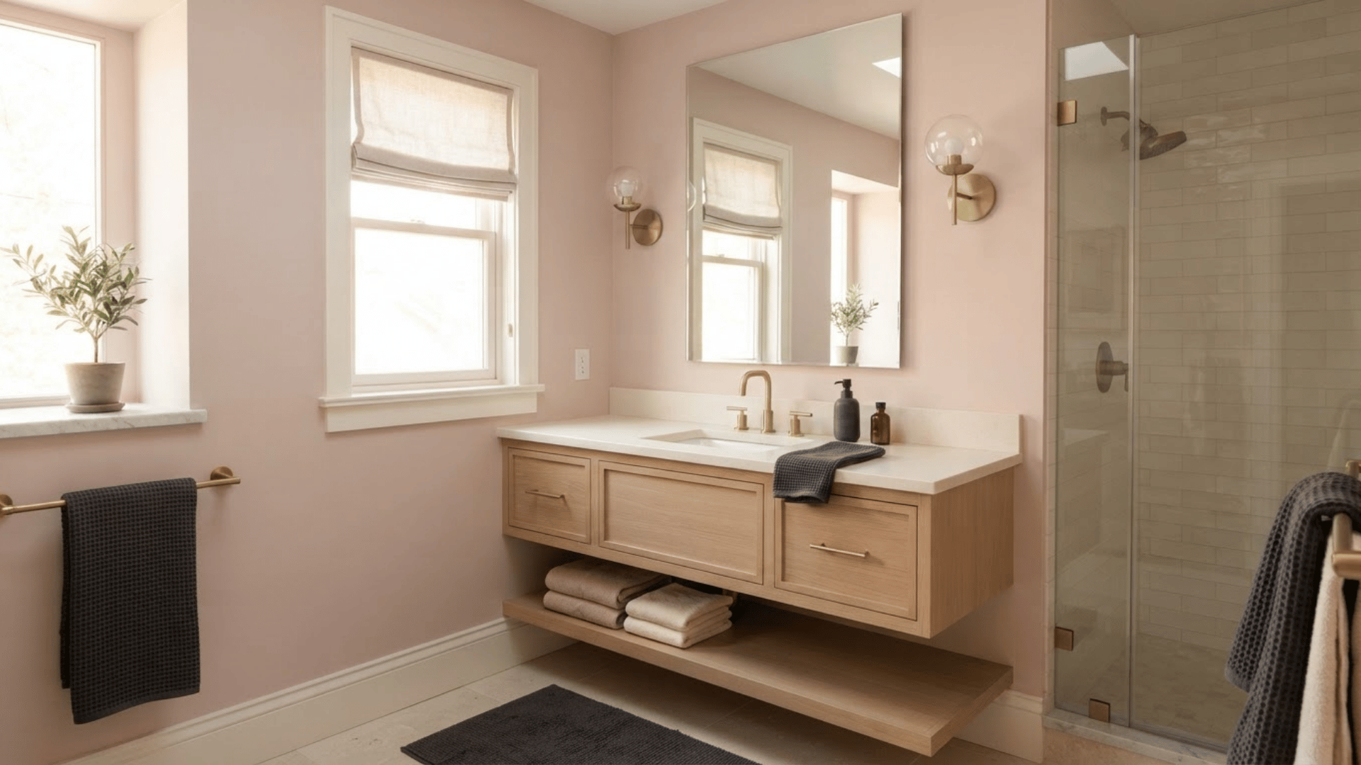
Soft pink can add warmth to a bathroom without creating an overly bright or sugary look. Muted pink shades pair nicely with warm white, cream stone, brass, light wood, and even charcoal accents.
They are especially useful in powder rooms or bathrooms that need a gentle break from common gray and blue palettes. Choose a dusty or beige-based pink for a softer finish.
Bright artificial lighting can strengthen pink undertones, so place a sample beside the mirror and check how it looks under the main vanity lights.
14. Dusty Rose
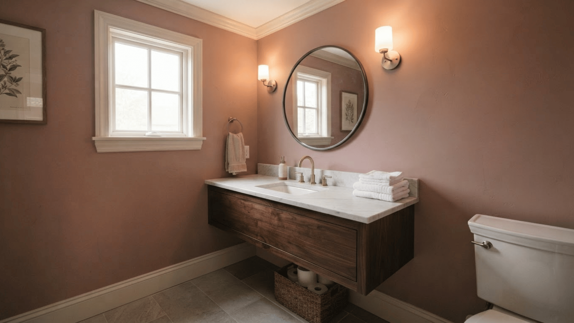
Dusty rose has more depth than pale pink and can give bathroom walls a warm, settled appearance. It works well with off-white trim, marble, dark wood, brass, and muted gray accents.
This color can be particularly effective in a powder room where a little more personality is welcome. Keep towels and accessories simple so the walls remain the main color statement.
If the room already has pink or peach tile, test carefully because a similar wall color can either connect the surfaces or make the scheme feel too uniform.
15. Muted Lilac
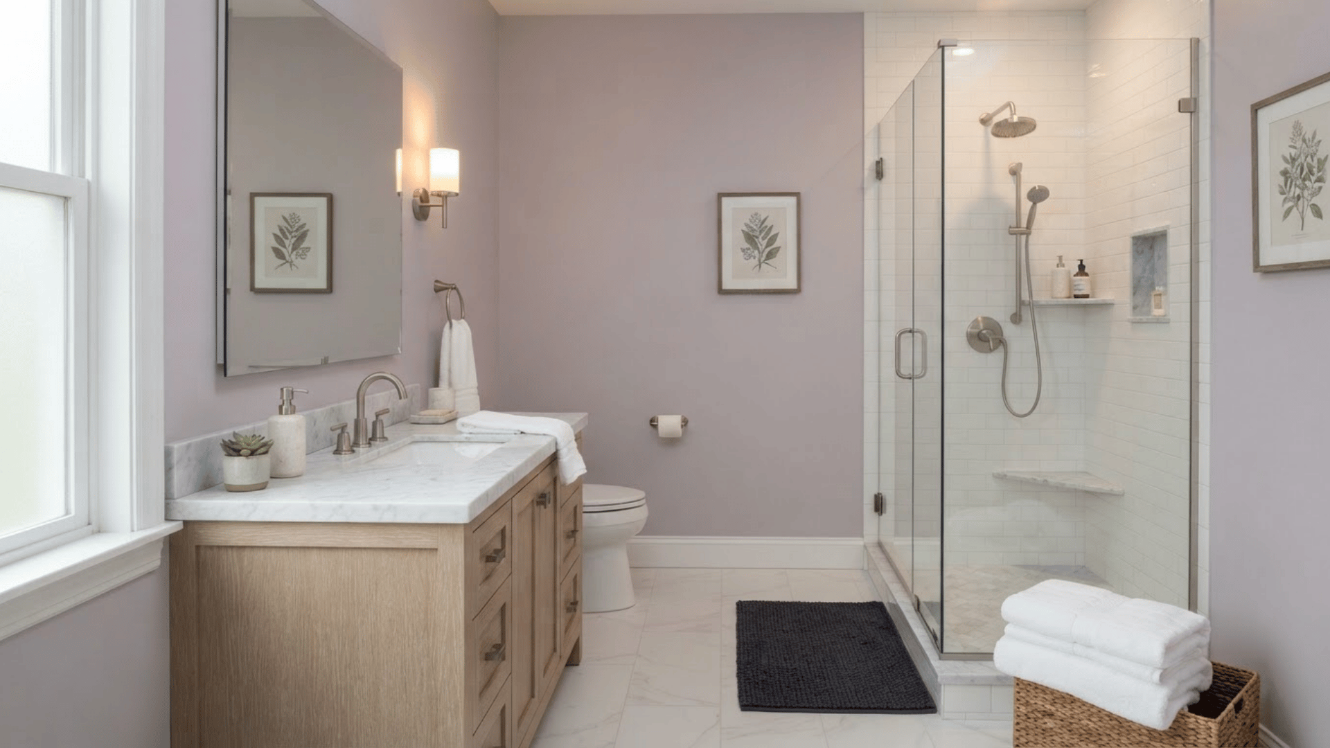
Muted lilac offers a soft alternative to blue, green, and gray. A gray-based lilac can work well with white tile, marble, brushed nickel, pale oak, and charcoal accents.
It adds noticeable color without feeling overly bright when the saturation stays low. This shade works well in bathrooms that receive gentle natural light, as daylight can bring out its cooler side.
Warm bulbs may make it appear softer. Place samples near large white fixtures first, since white surfaces make violet undertones easier to see.
16. Powder Blue
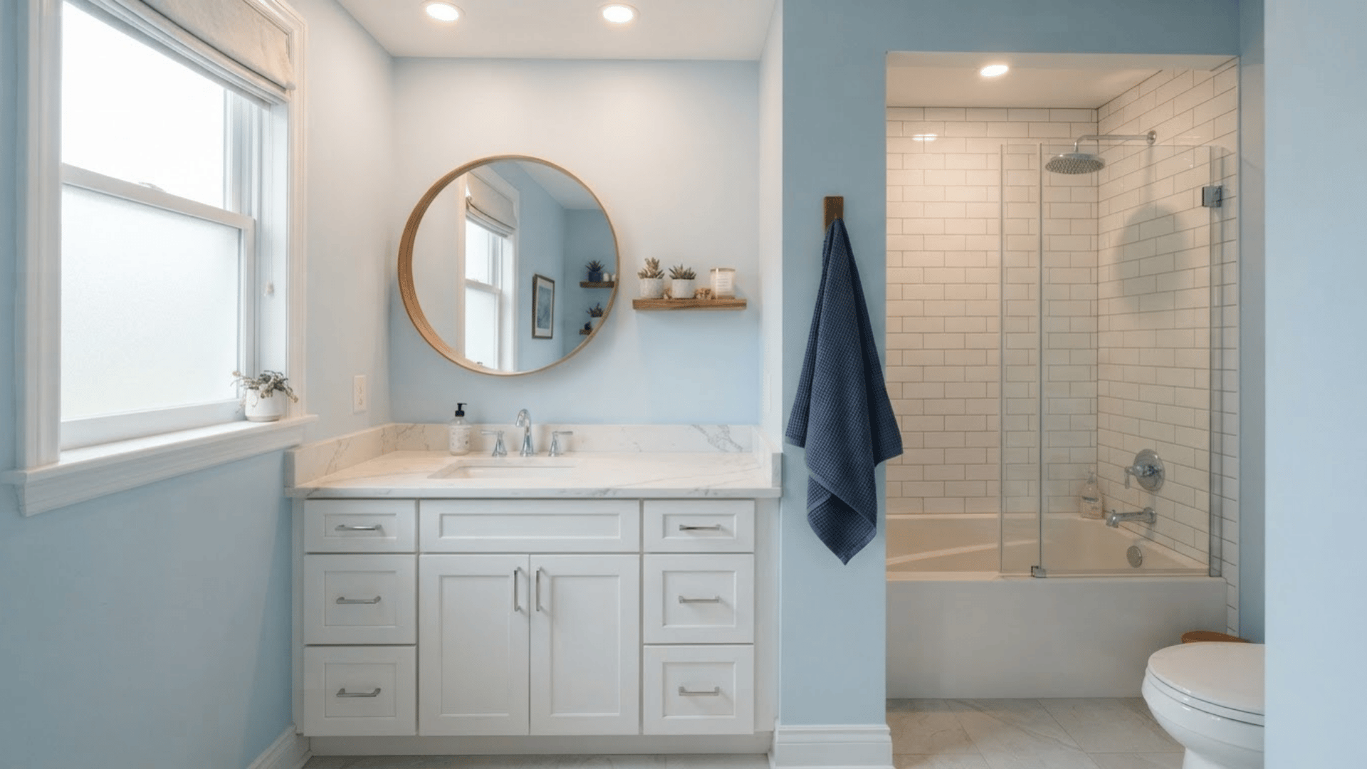
Powder blue is slightly clearer than blue-gray but remains soft enough for larger wall areas. It pairs naturally with white cabinetry, marble-look counters, chrome, pale flooring, and warm wood accents.
This shade can help break up a bathroom with many white surfaces while keeping the room visually light. It also works nicely with navy towels or a darker blue vanity.
Avoid adding too many different blue shades in one small room. Keeping trim, textiles, and accessories simple lets the wall color remain easy on the eye.
17. Teal
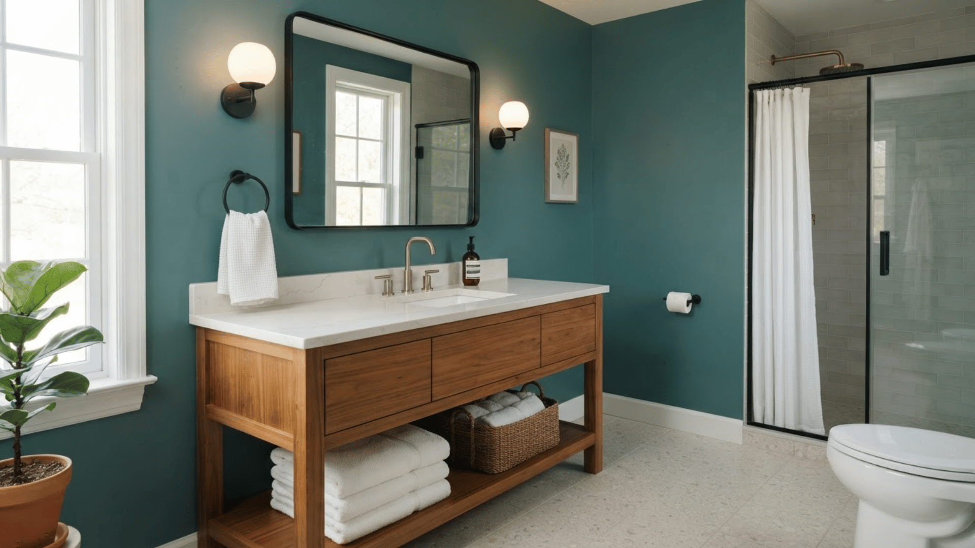
Teal mixes blue and green, giving bathrooms stronger color than pale spa shades. It works especially well against white sinks, light countertops, warm wood, brass, and black hardware.
A muted teal can cover all the walls in a well-lit room, while a deeper version may work better on a vanity wall or in a powder room.
Since teal is more saturated, keep competing colors to a minimum. Light towels, pale tile, and simple flooring can provide enough contrast to keep the bathroom from feeling visually heavy.
18. Navy Blue
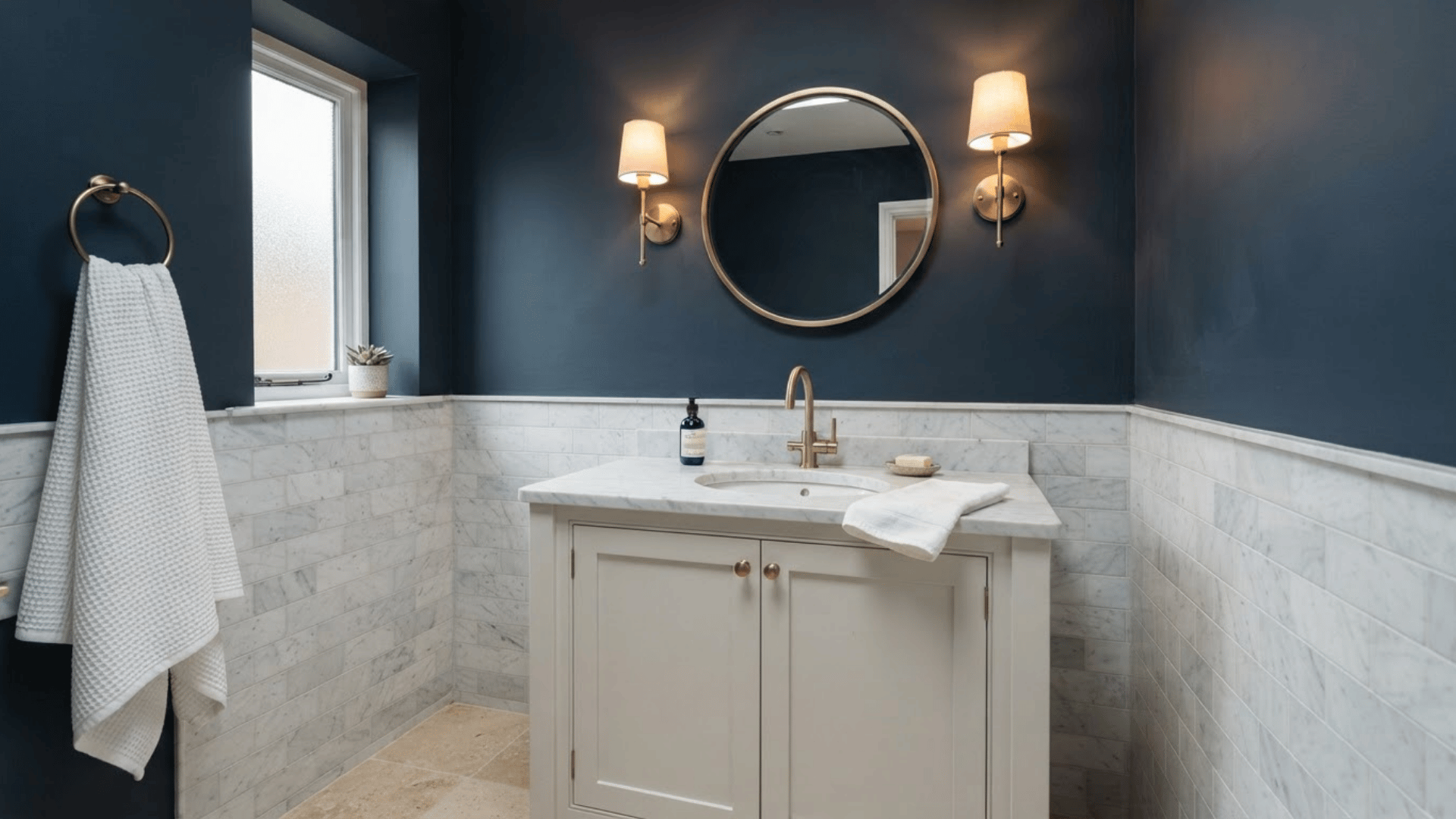
Navy blue creates strong contrast with white tile, marble, light counters, and pale cabinetry. It is a useful choice for powder rooms and larger bathrooms where deeper color can have space to breathe.
Brass hardware can bring warmth to navy, while chrome creates a cooler pairing. If the room is small, navy can still work when lighter surfaces balance it.
Use a large sample because some navy shades lean green, purple, or gray. Those undertones can become much more noticeable beside the floor and vanity.
19. Forest Green
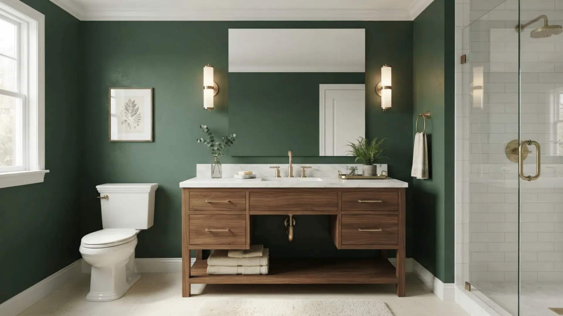
Forest green gives bathrooms a rich, grounded color and works well with white fixtures, marble, warm wood, brass, and cream accents.
It can make a strong statement in a powder room or add depth to a larger bathroom with plenty of light surfaces. Pair it with a pale countertop or white trim to create clear separation.
Because deep green absorbs more light than pale colors, lighting becomes especially important. Use warm bulbs carefully, as they can make some forest greens appear more yellow or olive than expected.
20. Charcoal
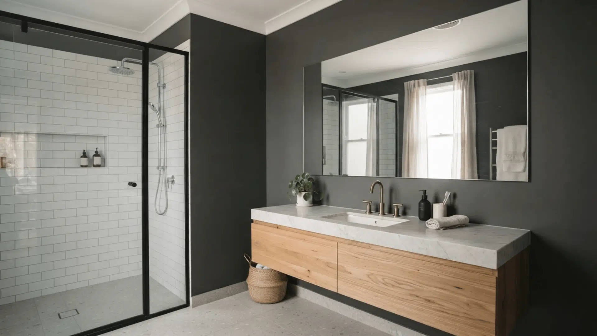
Charcoal is a strong neutral for bathrooms that need more contrast than standard gray. It works well with white tile, pale stone, natural wood, brass, chrome, and matte black details.
This shade can make a light vanity stand out and add more character to a powder room. It also works well on one main wall when painting the entire bathroom feels too dark.
Check the undertone before buying, as charcoal can lean blue, brown, or green. Lighter ceilings and countertops can help maintain visual balance.
21. Deep Blue-Green
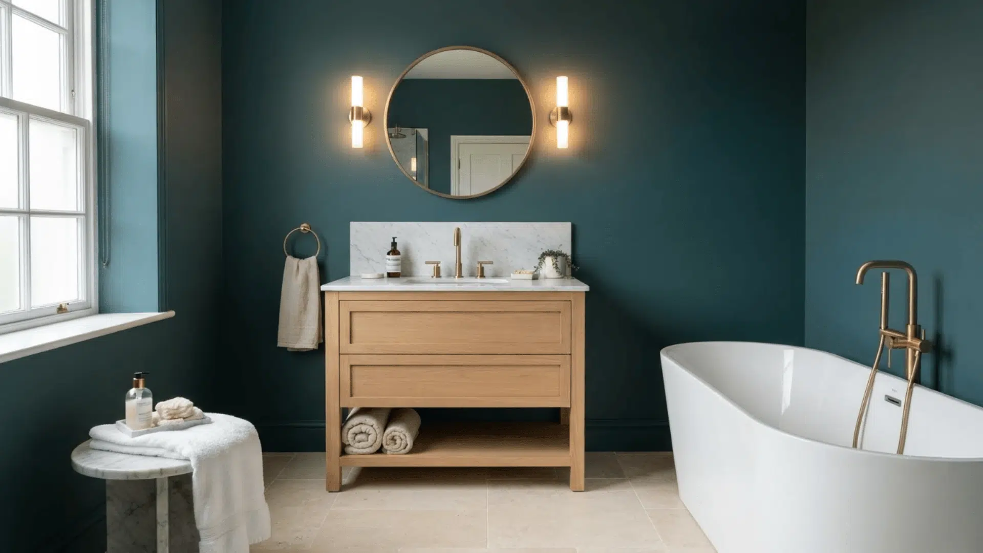
Deep blue-green offers a strong mix of cool blue and natural green tones. It can work beautifully with white porcelain, marble, warm wood, brass, and pale stone.
The color suits bathrooms that need a stronger focal point without using black or charcoal. It is especially effective behind a light vanity or on walls surrounding a freestanding tub.
Keep nearby finishes simple so the shade has room to breathe. Test it under artificial lighting because some versions can appear clearly blue at one time and greener later.
Best Bathroom Paint Colors by Brand
Paint brands offer their own bathroom-ready color collections, from soft whites and greens to deeper blues and neutrals. Here are some useful shade options from trusted names.
Benjamin Moore
Benjamin Moore offers soft neutrals, muted greens, airy blues, and warmer whites that pair well with common bathroom finishes and lighting.
- Swiss Coffee OC-45
- Natural Cream OC-14
- Saybrook Sage HC-114
Sherwin-Williams
Sherwin-Williams includes light pastels, blue-greens, whites, and deeper tones that can suit both small bathrooms and larger spaces.
- Window Pane SW 6210
- Fresh Eucalyptus SW 9658
- Cascades SW 7623
Behr
Behr features soft whites, greens, grays, and blue-green shades that work with tile, vanities, stone, and other bathroom surfaces.
- Mild Mint PPU11-12
- Cameo White MQ3-32
- Brook Green N410-2
The Home Depot
The Home Depot shares bathroom color ideas across whites, blues, greens, grays, and warm neutrals, along with paint and finish suggestions.
- Warm White
- Soft Sage
- Pale Blue
Lowe’s
Lowe’s covers bathroom paint ideas ranging from sage and taupe to pale blue, black, and other stronger accent shades.
- Warm Eucalyptus
- Artistic Taupe
- Nostalgia
Common Bathroom Paint Color Mistakes
Choosing a color from a tiny paper chip is one of the easiest ways to end up with the wrong shade. Bathroom lighting can change how paint looks, especially in windowless rooms.
Another mistake is ignoring fixed finishes. A cool white may clash with cream tile, while a warm beige can look muddy beside cool gray flooring.
Matching every surface too closely can also make the room feel flat. Some contrast between the walls, vanity, trim, and tile helps each surface stand out.
Do not rely only on a room photo online. Paint can look very different at home. Test large samples beside tile, countertops, grout, flooring, and fixtures, then check them under natural and artificial light.
Conclusion
A bathroom color earns its place when it still looks right during an early morning routine, under bright vanity lights, and beside every permanent finish in the room.
It makes real-wall testing far more useful than falling for a paint chip at the store. It also shows how the shade reacts to the room’s lighting, tile, and other fixed finishes.
Choose three shades that fit the tile, vanity, and flooring, then give each one a fair test before buying the full amount.
A little patience now can save another paint job later. Pick a favorite from the list, bring home a sample, and see how it performs in the actual space.
Frequently Asked Questions
Should Bathroom Trim and Walls Use The Same Color?
They can. Using one color with different paint sheens can create subtle separation without adding another shade to the room.
Can Bathroom Paint Look Different After It Dries?
Yes. Wet paint often appears different from fully dried paint, so judge the final shade only after the sample has dried completely.
Does Mirror Size Affect How Wall Color Looks?
A large mirror reflects more walls, fixtures, and light, which can make a strong paint color appear more noticeable throughout the room.