

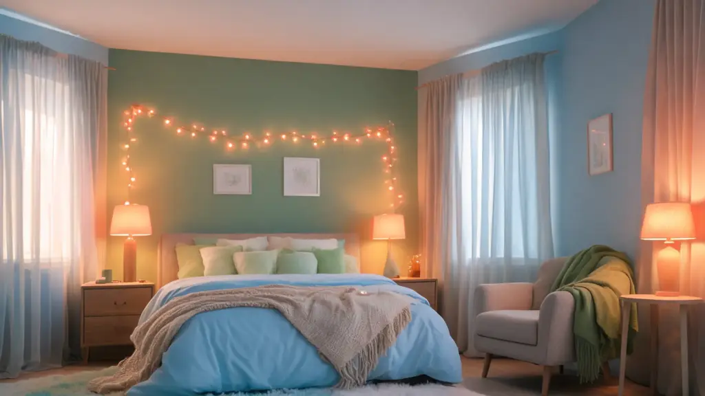
Night after night of staring at the ceiling, and the culprit might be hiding in plain sight. After years of studying sleep science and helping people redesign their rest environments.
I’ve found that bedroom color is one of the most underestimated factors in sleep quality. What color helps you sleep isn’t a trivial question; it’s one with real physiological answers.
From wall pigments that calm the nervous system to warm-toned bedroom lighting that preserves melatonin, the right color choices work quietly in your favor. This article covers the science behind sleep colors, the best wall and light options, how to layer them effectively, and practical rules to implement tonight.
Why Color Affects How Well You Sleep
Color affects sleep through two pathways that most people, and most bedroom guides, treat as one. Understanding both is what makes the difference between a room that looks calming and one that actually is.
- Wall color works psychologically. Bedroom wall color influences arousal. Research shows that blue interiors increase calmness, while red and yellow elevate alertness across age groups. Cool, low-saturation hues lower mental stimulation at bedtime, easing the wind-down process without sedating.
- Light color works biologically. Specialized retinal cells called ipRGCs have a photopigment (melanopsin) that is mainly sensitive to around 480 nm (blue light). When they detect it, they suppress melatonin via the brain’s circadian clock in the suprachiasmatic nucleus. A 2025 study found blue light at 464 nm significantly suppressed melatonin over three hours, while red light at 631 nm did not.
- The two interact in a way most guides miss. A 2025 study shows wall color affects light in a bedroom: white walls boost circadian effects, while warm, matte walls absorb and soften light. Your choice of wall color influences your biological response to lighting.
Wall color and light color are not independent decisions; they compound each other. Get both right, and the effects stack. The rest of this article shows you how.
Best Colors for Sleep: Walls and Lighting That Actually Work
Your bedroom’s walls and lighting work together to shape the environment your brain interprets at bedtime. Here’s what the evidence and my own experience point to as the most effective choices.
1. Blue Walls
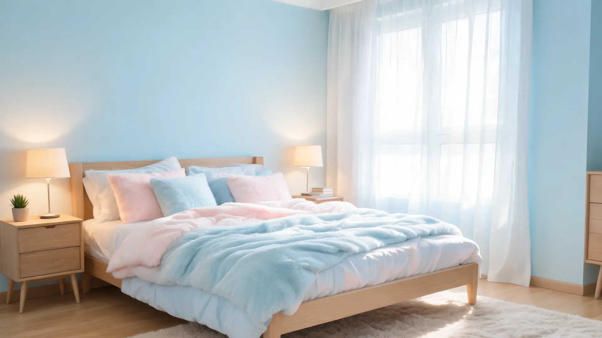
Light shades of blue, sky blue, soft teal, and dusty slate consistently rank among the most sleep-friendly wall colors in environmental psychology research.
The color is psychologically associated with open skies and calm water, which can lower perceived arousal and help your mind slow down.
Blue walls also have a practical benefit: they make a room feel more spacious, which reduces the sense of confinement that can heighten nighttime anxiety, the same logic behind why relaxing bedroom color palettes tend to favor open, airy tones over saturated ones.
Pair them with warm amber or soft orange bulbs in the evening; the visual contrast between cool walls and warm light is particularly effective at creating that late-evening, winding-down atmosphere.
2. Green Walls
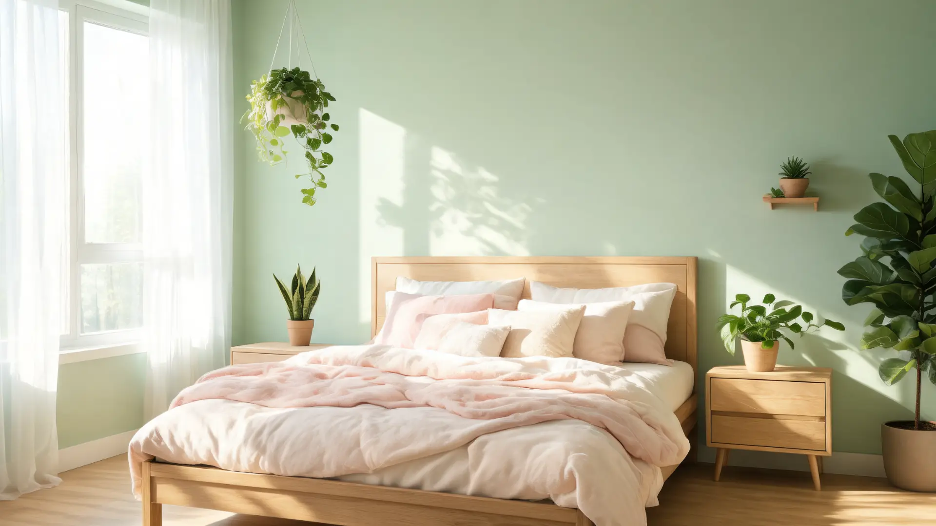
Muted greens, sage, eucalyptus, soft olive, tap into what researchers call the biophilic response: the instinctive sense of calm humans feel in natural environments. Softer green shades reduce visual tension without making a room feel cold or stark.
Green works especially well alongside indoor plants or natural wood furniture, which reinforce the nature-connected feeling. Stick to muted, grey-leaning greens rather than bright or yellow-toned ones; those read as energizing rather than calming.
A soft sage with dimmable warm lighting is one of my most frequently recommended combinations for people who find pure blue too cold.
3. Neutrals (Beige, Soft Gray, White)
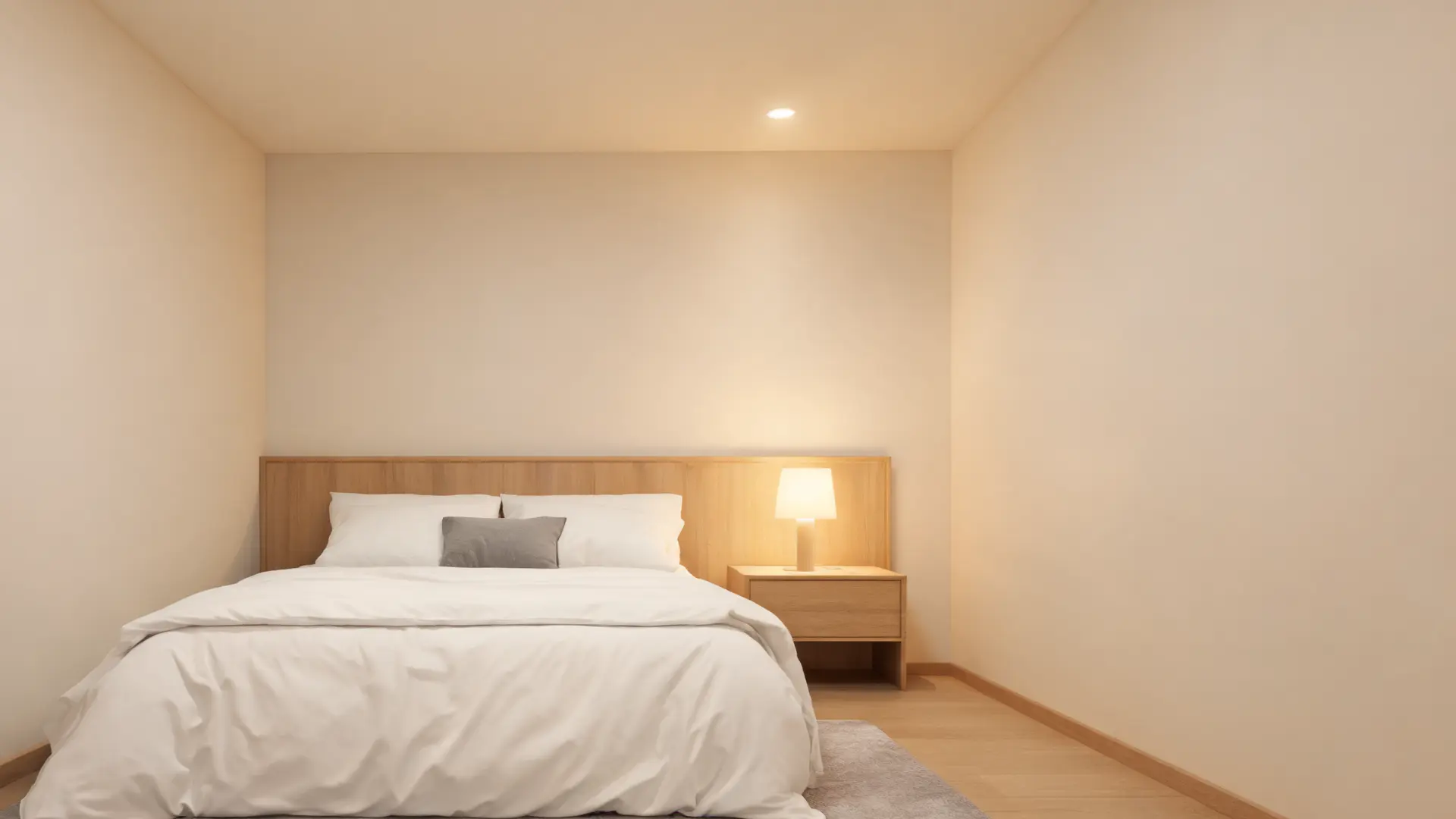
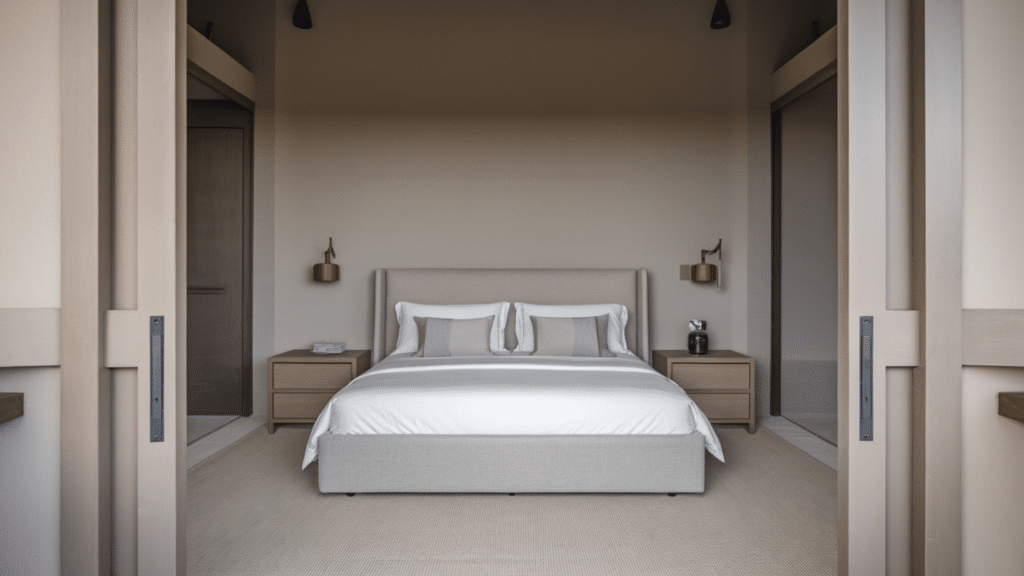
Neutrals work because they eliminate visual competition. Beige, warm gray, and off-white walls give your eyes nothing to process, which helps your brain downshift after a stimulating day.
They’re also the most flexible base; you can shift the mood entirely through your lighting and textile choices without repainting.
One thing to watch: bright white can read as clinical and high-contrast under certain bulbs. Opt for warm whites and off-whites with a slight cream or greige undertone.
These absorb warm evening light beautifully and don’t reflect harshly the way cool whites do.
4. Pastels (Soft Pink, Lavender)
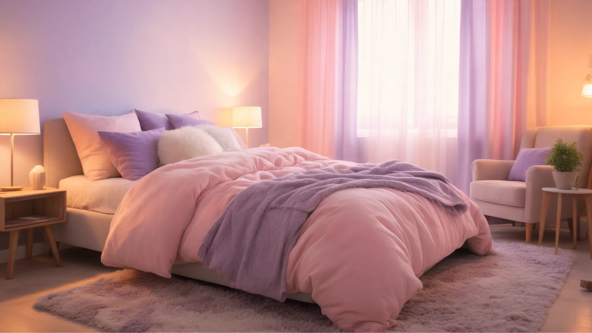
Muted pinks and lavenders have a genuinely calming effect, particularly for people who find blue or green too cool-feeling. These tones work with low saturation; it’s not the hue itself but the softness that matters. A dusty rose reads completely differently from a hot pink, and that difference is the whole point.
Lavender in particular has some support in aromatherapy research as a scent that promotes relaxation; having the wall color echo that association can add a subtle reinforcing effect. Pair pastel walls with warm-toned soft furnishings and dim amber lighting to complete the effect.
5. Red Light
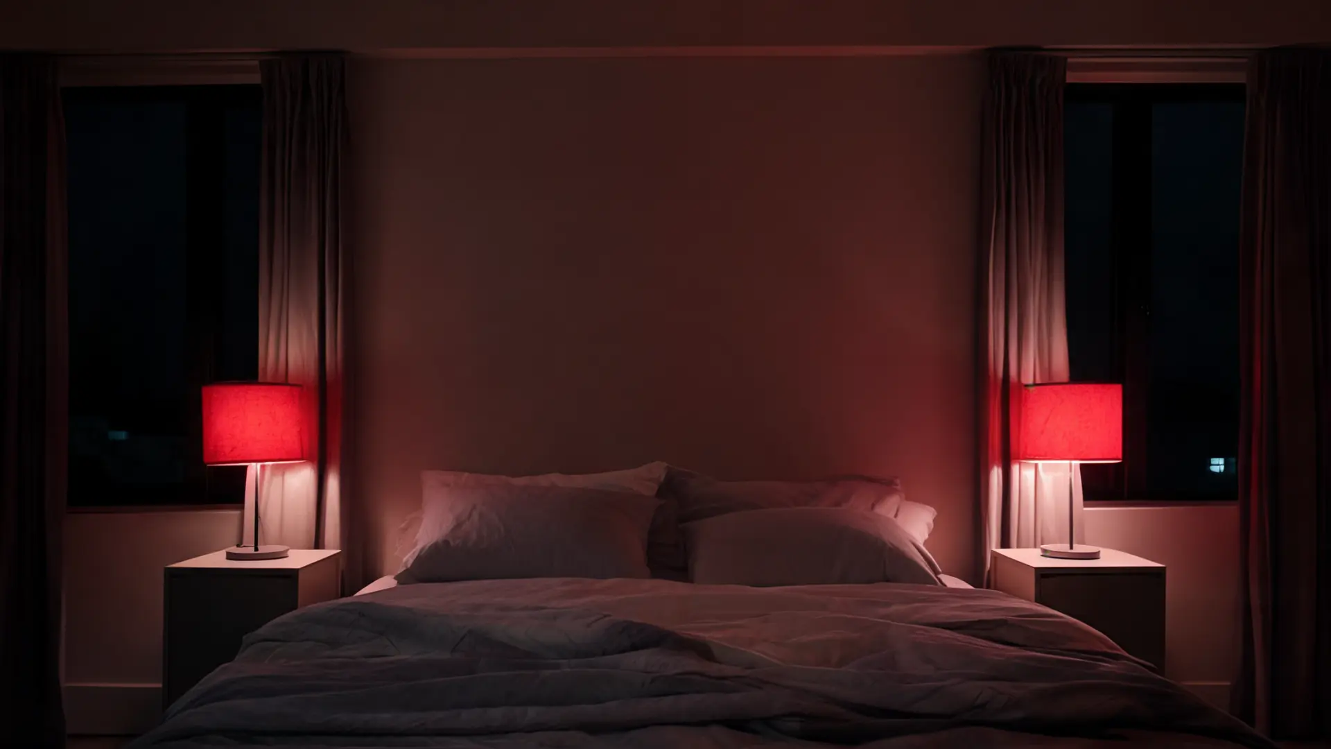
Red light sits at the long-wavelength end of the visible spectrum, which is why it has minimal impact on melatonin production, unlike the blue light from screens and overhead LEDs, which actively suppress melatonin after dark.
This makes it the most biologically inert light source you can use after dark; your body’s circadian system largely ignores it. For people dealing with insomnia or those who genuinely need some light in the bedroom at night, for reading, navigating, or winding down, a low-intensity red bulb is far preferable to switching on a standard lamp.
It provides enough illumination to function without sending your brain the “it’s daytime” signal. Keep it dim. Even red light at high intensity can be stimulating; the goal is a gentle glow, not a full-brightness red bulb.
6. Amber & Orange Light
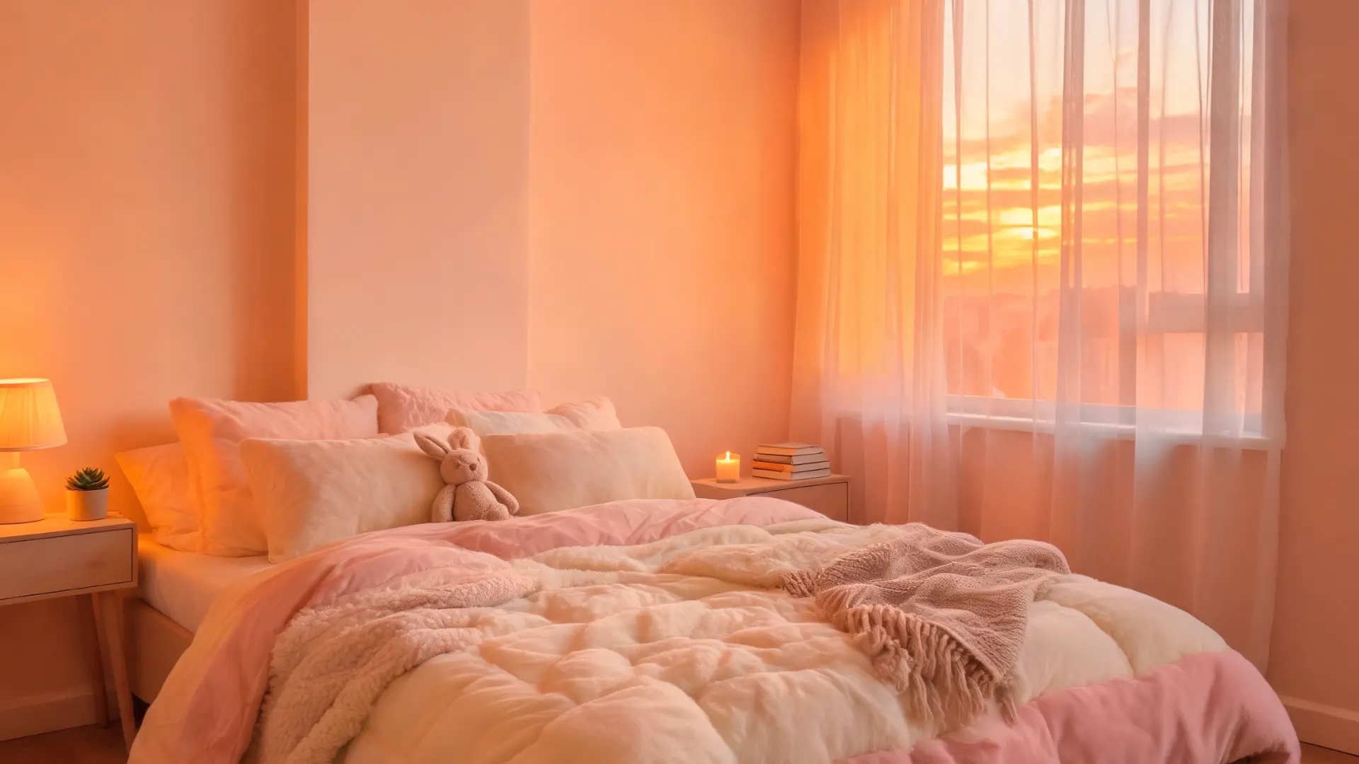
Amber and soft orange light closely mimic the color temperature of a candle flame or a low sun, roughly 1800–2200 Kelvin. This is significant because humans spent most of evolutionary history winding down by firelight, and our circadian systems appear calibrated to read those warm wavelengths as an end-of-day cue.
Smart bulbs that shift from cool white during the day to amber in the evening are among the highest-impact changes I recommend, sitting alongside calm bedroom paint choices as one of the lowest-effort, highest-return adjustments you can make.
The transition occurs gradually, mirroring the natural light shift at dusk and making the body’s internal clock more reliable over time.
Amber light pairs well with almost any wall color, but it’s especially effective with cool-toned walls; the contrast creates a genuinely immersive, cave-like sense of evening.
| In short: Cool, soft wall colors lower arousal and reduce visual stimulation. Warm-wavelength lighting (red, amber, soft orange) preserves melatonin after dark. Used together, they address both the psychological and biological sides of sleep preparation. |
How to Combine Wall Color and Lighting for Better Sleep
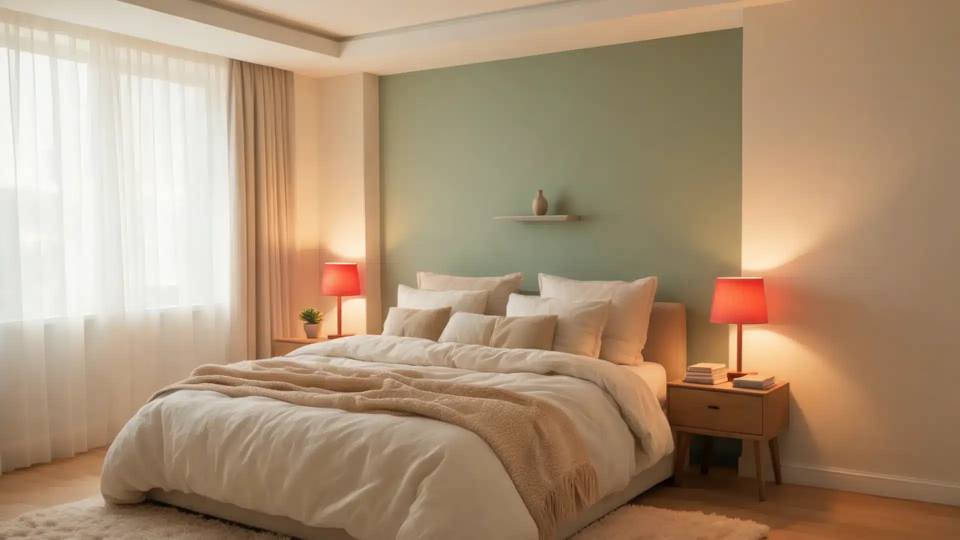
Getting the wall color right is only half the equation. How you layer it with lighting and accessories is what turns a pleasant-looking room into one that genuinely supports sleep. These combinations give you a practical starting point.
| Category | Details & Recommendations |
|---|---|
| Wall + Light Combos | Cool walls with warm light create a sleep-friendly contrast. Try light blue with amber lamps, sage green with red nightstand lighting, or warm gray with candlelight bulbs. The calmness of the color and the sleep-promoting light reinforce each other. |
| Accent Wall Strategies | If repainting the whole room isn’t feasible, a calming accent wall behind the bed can change the room’s feel. A soft sage or dusty blue behind the headboard, with warm lighting on other walls, adds depth without overwhelming the space. |
| Bedroom Accessories | Keep textiles, curtains, bedding, and rugs in shades close to your wall color. High contrast creates visual noise and can increase alertness. Muted, tone-on-tone layering keeps the room visually calm. |
Simple Rules for a Sleep-Friendly Bedroom
Putting this into practice doesn’t require a full renovation. These four rules cover the decisions that make the biggest difference, in the order I’d tackle them.
- Choose your wall color with undertones in mind. Choose calming colors like soft blue, muted green, pastel, or warm neutrals, but consider undertones. Green with yellow undertones feels energizing; blue with purple undertones appears cooler and calming. Test samples on your wall in daylight and evening light, as colors change with lighting.
- Replace evening lighting first. Swap overhead white LEDs for warm amber or red bulbs in bedside lamps and dim them before sleep. Avoid cool white or daylight bulbs (5000K+) in the bedroom; blue light is the biggest lighting mistake I see, and red light therapy at night offers a compelling biological case for switching to warmer wavelengths instead.
- Keep textiles within the same color family. Curtains, bedding, and rugs don’t need to match exactly, but high-contrast combos like a bright white duvet against dark walls or colorful pillows on a neutral base create visual stimulation that offsets the calming effect of the wall color. Blackout curtains that match the walls are ideal for light control and visual calm.
- Track changes over several nights. Don’t judge a color change after one night. Sleep quality depends on many factors, and a single night reveals little. Allow five to seven nights to observe how sleep onset feels and adjust accordingly. Aim for a room that feels lower-arousal after 9 pm.
Real Experiences: What People Notice When They Change Their Bedroom Lighting

A thread on r/LIFX started with someone saying they’d read that red light was best for sleep and asking if anyone had actually tried it.
The replies were telling. Several users confirmed they’d been running their LIFX bulbs on a deep red setting since around 9 pm and noticed they were falling asleep earlier without much effort.
A few mentioned the night vision benefit, waking in the night without the jarring blindness a white lamp causes. One commenter pushed back, saying that red light made them feel more alert, not less, and that they had switched to amber instead.
That pushback rings true to me. Red works for most people because the biology supports it, but the visual effect is strong, and individual associations with the color matter more than people expect. When red feels wrong, amber is almost always the better starting point.
Frequently Asked Questions
Does the paint finish on bedroom walls affect sleep quality?
Yes, and it’s often overlooked. Matte and eggshell finishes absorb light rather than reflecting it, which reduces glare and keeps the visual environment softer at night. Satin or semi-gloss finishes can create reflective hotspots under evening lamps, adding a subtle but real source of visual stimulation. For a bedroom, matte is almost always the better choice; it also tends to read as slightly richer in color, which means your calming wall shade shows up exactly as intended.
Can you use dark colors in a bedroom and still sleep well?
Dark colors aren’t automatically bad for sleep; deep navy, charcoal, or forest green can feel genuinely cocooning and low-stimulation for some people. The risk is that dark walls absorb so much light that even a warm lamp can feel dim and slightly oppressive, which can tip the balance from calming to uncomfortable. If you want to use dark tones, prioritize warm-temperature lighting (2200–2700K), use multiple low-level light sources rather than one bright one, and keep bedding light to provide some visual contrast without making the room feel stark.
Does ceiling color influence sleep?
More than most people expect, because the ceiling is the last thing you see before closing your eyes. A pale, warm-toned ceiling (soft white, very light cream, pale blush) keeps the visual field relaxed when you’re lying down. A bright white ceiling under warm lamps can look yellowish and slightly jarring. A dark ceiling can feel heavy unless the room is specifically designed for it. Pale and matte is the reliable default.
Can seasonal color adjustments improve sleep throughout the year?
Switching between lighter, cooler tones in summer and warmer, slightly deeper shades in winter, even just through textiles and lighting temperature, can help your bedroom stay in sync with natural light changes across the year. This matters because your circadian rhythm responds to seasonal light cues. A bedroom that feels right in July but too bright and cold in December is worth adjusting, even if only through bedding choices and bulb temperature, not a full repaint.
Is it worth buying smart bulbs just for sleep?
For most people, yes. The ability to automatically shift from cool white during the day to warm amber or red in the hour before bed, without needing to remember to change anything, removes a significant source of behavioral failure. Habit-based sleep hygiene improvements are hard to maintain; automated ones aren’t. A set of smart bulbs in the bedroom and living room is one of the most cost-effective sleep environment upgrades available, and the effect on evening light exposure is immediate and measurable.
Conclusion
The colors surrounding you at night aren’t neutral; they either work with your sleep or quietly against it.
Choosing what color helps you sleep well means thinking about two separate layers: the wall pigments that shape how your brain interprets the room, and the bedroom lighting color that either preserves or disrupts your melatonin after dark.
Blue, green, and muted neutrals on the walls; red or amber light in the evenings- these aren’t aesthetic preferences; they’re physiologically grounded choices.
Start with your lighting, layer in your textiles, and let your walls do the rest. What changes will you try first? Share your experience in the comments.