
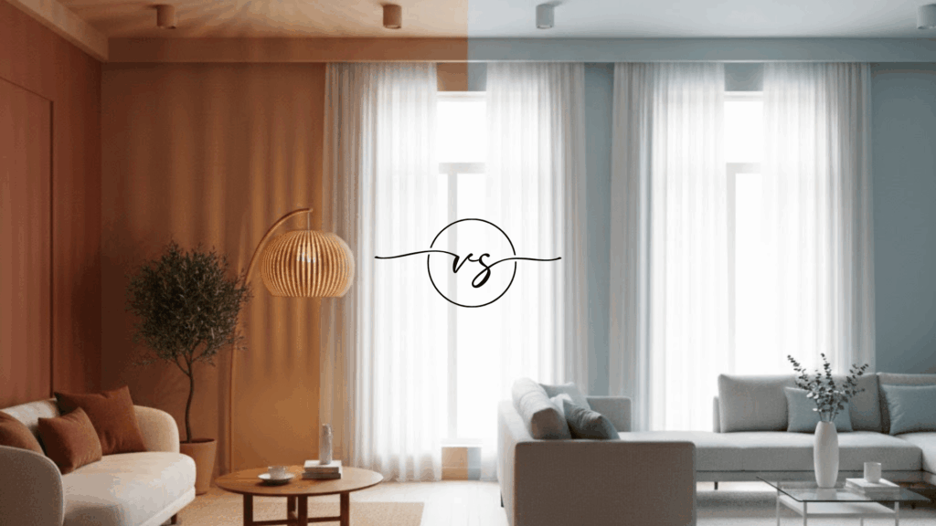
Have you ever walked into a room and felt instantly cozy or suddenly calm? That feeling comes from warm vs cool colors around you. Colors carry temperatures that change how spaces make you feel.
Warm tones bring energy and excitement into any area. Cool tones create peaceful and relaxing vibes instead. I want to help you understand which temperature works for different situations. Your color choices affect more than just how things look.
They change the entire mood and feeling of any space. The temperature you pick influences how people react and behave. It shapes first impressions and lasting memories too.
Understanding color temperature gives you power over any environment. Let me show you how these temperatures work their magic everywhere.
Getting to Know Warm and Cool Colors
I want you to understand the difference between warm and cool colors before you pick paint. Warm colors remind you of fire, sunshine, and heat. These shades feel energetic and cozy when you look at them.
They make spaces feel more intimate because they visually move forward toward you. Cool colors make you think of water, sky, or shade under a tree. These shades feel calm and relaxing in any room.
They do something different to your walls than warm colors do. Cool shades naturally step back from you instead of coming forward.
This makes them perfect for opening up tight spaces. Your brain reads warm colors as closer and cool colors as farther away.
Warm Colors vs Cool Colors: Core Differences
I need you to understand that warm and cool colors affect your space in completely opposite ways. Here’s how each type changes what you see and feel:
1. Color Temperature and Visual Feel
Warm colors have this weird ability to make your walls look closer than they actually are. Your eye reads them as advancing toward you in the room. This can make spaces feel smaller and more enclosed.
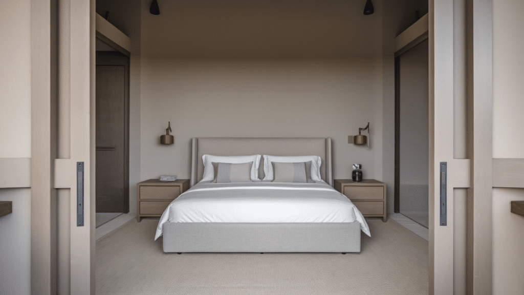
Cool colors do the exact opposite thing to your perception. They make your walls appear to step back and recede away from you. Your room suddenly feels more open and spacious when you use these shades.
2. Emotional and Psychological Effects
Warm colors hit you with energy and excitement the moment you walk into a room. They make you feel more alert and stimulated.
These shades can actually raise your energy level and make you feel warmer physically. Cool colors calm you down and help you relax without even trying. They lower your stress and make you feel more peaceful. Your mind associates them with rest and tranquility automatically.
3. Energy, Movement, and Calm
Warm colors create movement and activity in your space that you can actually feel. They stimulate conversation and make rooms feel more social and lively. You’ll notice people naturally gather in spaces painted with these shades.
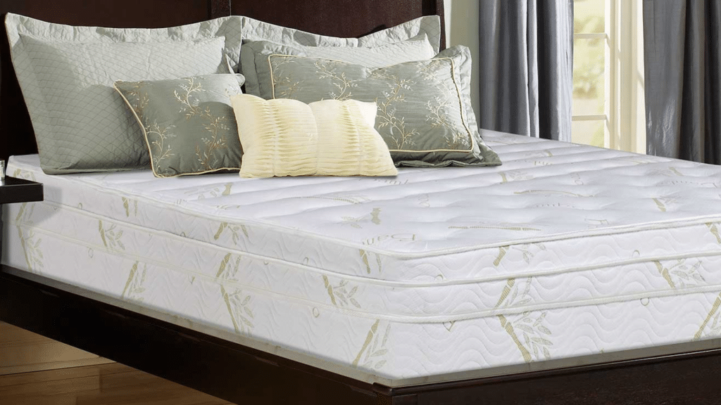
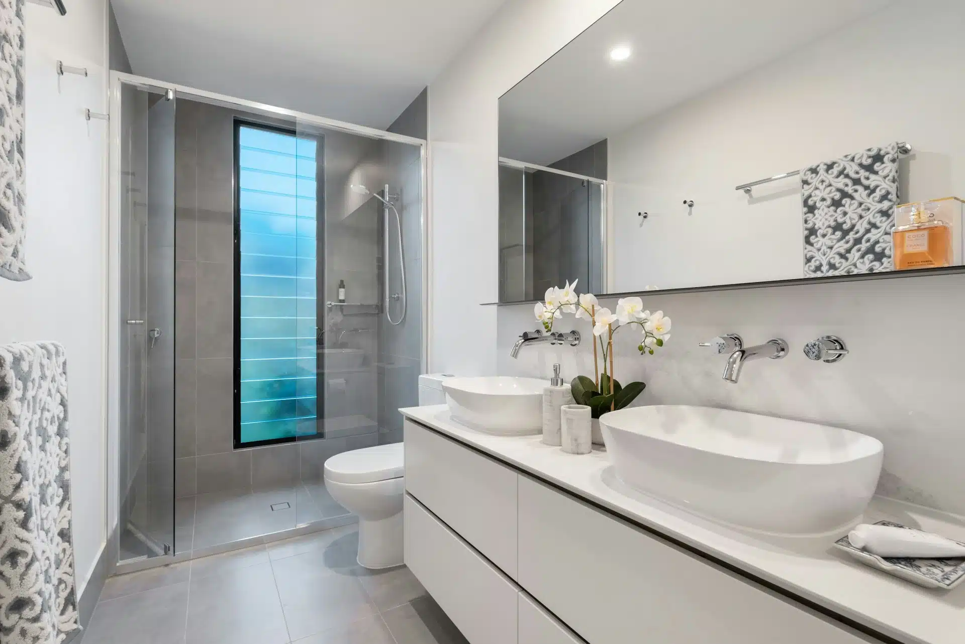
Cool colors slow everything down and create a sense of stillness around you. They’re perfect for bedrooms and bathrooms where you want to unwind. Your space feels quieter and more restful with these colors on the walls.
Warm Tones vs. Cool Tones Explained
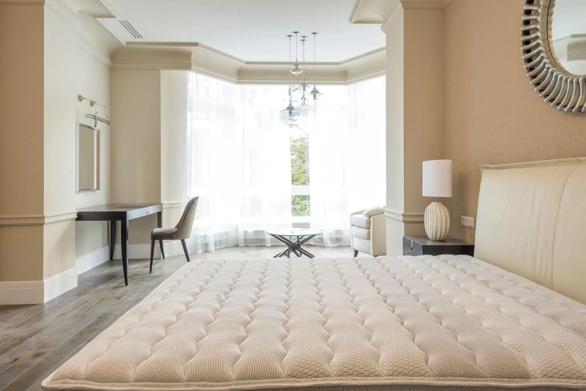
I need to clear up something that confuses a lot of people about paint colors. Tone is different from the actual color you pick. A warm tone has hints of fire colors mixed into it. You might see a gray with some beige or yellow undertones.
That makes it a warm gray even though gray itself isn’t a warm color. Cool tones have hints of water colors mixed in. The same gray can look cool if it has blue or green undertones instead.
This is why you can have warm whites and cool whites. The base color stays the same but the undertones change everything. Your walls will look totally different depending on which tone you choose.
The Warm and Cool Color Wheel
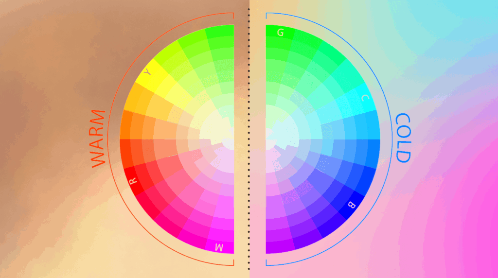
I want to show you how the color wheel splits into warm and cool sides. One half has all the fire and sunshine shades. The other half has all the water and sky shades. The warm side runs from deep reds through oranges and yellows.
The cool side goes from greens through blues and into purples. Some colors sit right in the middle and can swing either way. These middle colors like green and purple can look warm or cool depending on their undertones.
Neutrals like gray, beige, and white don’t really have a set side on the wheel. They take on warmth or coolness based on what’s mixed into them.
You’ll find both warm grays and cool grays in paint stores. The same goes for beiges and whites too.
Examples of Warm and Cool Colors
I find that seeing actual color examples makes it way easier for you to understand warm and cool differences. Here are the most common shades you’ll find in each category:
Common Warm Color Examples
Let me show you which colors fall on the warm side of the spectrum. These are the shades that remind you of heat and energy:
| Color Family | What It Looks Like | Common Paint Uses |
|---|---|---|
| Reds | Fire engine, brick, cherry, wine | Accent walls, dining rooms, cozy spaces |
| Oranges | Pumpkin, terracotta, coral, peach | Kitchens, living rooms, creative spaces |
| Yellows | Sunshine, butter, gold, mustard | Cheerful rooms, entryways, breakfast nooks |
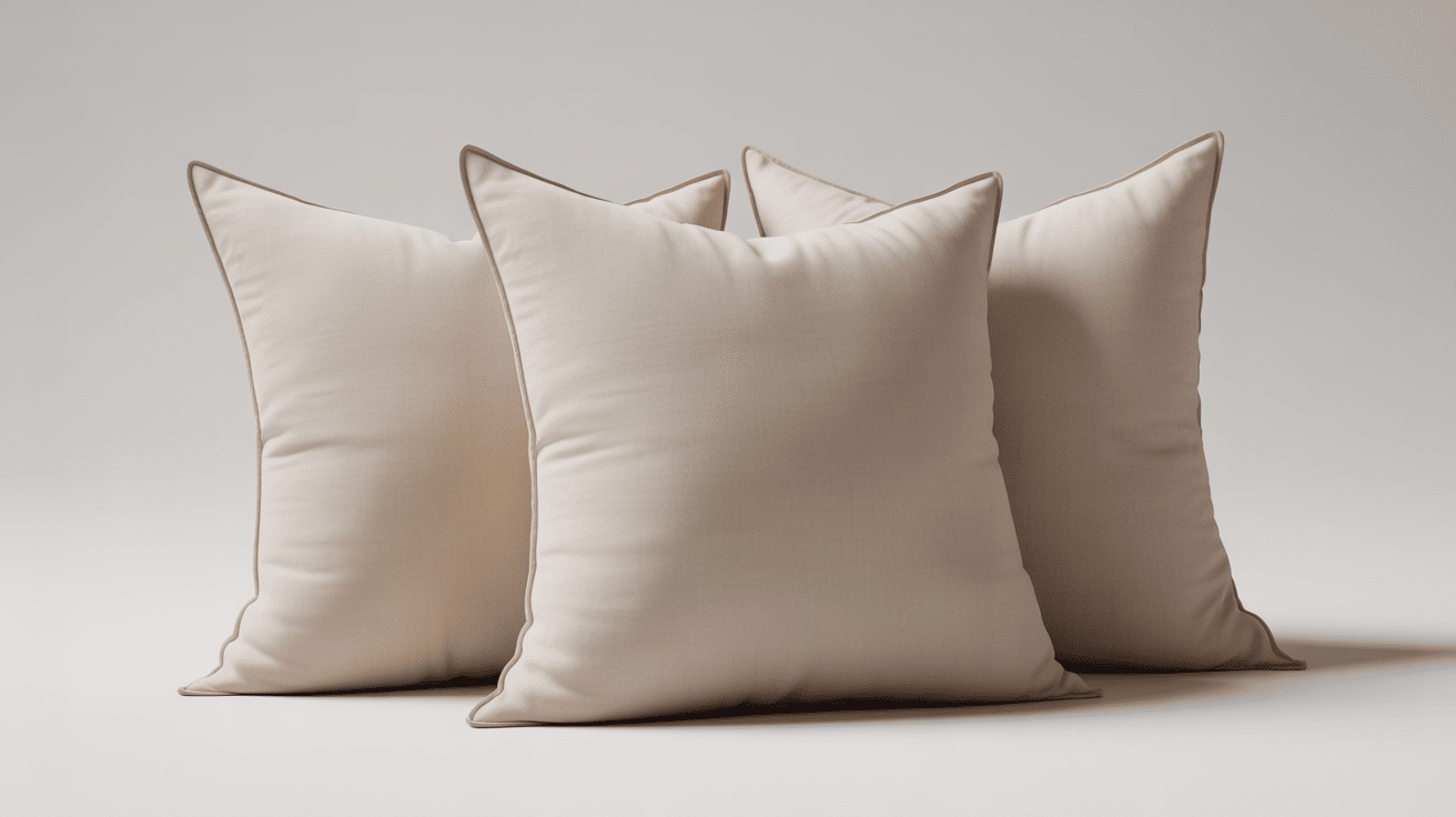
| Warm Browns and Beiges | Caramel, tan, sand, coffee | Living rooms, bedrooms, versatile neutrals |
These warm colors bring energy and coziness into your space. They make rooms feel more intimate and inviting when you use them right.
Common Cool Color Examples
Now let me show you the colors that sit on the cool side. These shades remind you of water, sky, and peaceful outdoor scenes:
| Color Family | What It Looks Like | Common Paint Uses |
|---|---|---|
| Blues | Sky, navy, aqua, powder blue | Bedrooms, bathrooms, calming spaces |
| Greens | Mint, sage, forest, seafoam | Any room, nature-inspired spaces |
| Purples | Lavender, plum, lilac, violet | Bedrooms, creative spaces, accent walls |
| Cool Grays and Whites | Steel, slate, icy white, silver | Modern spaces, open floor plans, versatile neutrals |
These cool colors create calm and make your walls step back visually. They’re your best choice when you want rooms to feel more spacious and relaxing.
Using Warm vs Cool Colors Together
You don’t have to pick just warm or just cool colors for your entire space. I’ve seen plenty of rooms that mix both temperatures and look amazing.
The trick is choosing one temperature as your main color and using the other as an accent. Let one side dominate while the other just adds little pops of contrast.
You might paint your walls a cool gray and add warm wood furniture or accessories. Or you could go with warm beige walls and bring in cool blue pillows and art.
Balance keeps things from feeling too hot or too cold in your space. Your room feels more complete when both temperatures work together instead of fighting each other.
Warm vs. Cool Colors in Everyday Use
Warm and cool colors show up everywhere in your daily life beyond just paint. Understanding how they work helps you make better choices in all these areas:
| Area of Use | How Warm Colors Work | How Cool Colors Work |
|---|---|---|
| Clothing and Fashion | Draw attention and make you look energetic and approachable. | Create a slimming effect and make you look calm and professional. |
| Art and Visual Design | Bring elements forward and create energy and movement in artwork. | Push elements back and create depth and calm in artwork. |
| Branding and Marketing | Signal excitement and urgency to encourage quick customer action. | Signal trust and reliability to build long-term customer confidence. |
| Photography | Create warmth and intimacy in photos with cozy feelings. | Create distance and drama in photos with peaceful feelings. |
| Food Presentation | Make food look more appetizing and stimulate hunger. | Make drinks look refreshing and create clean healthy impressions. |
I hope you can see how color temperature influences almost everything you interact with daily.
Final Words
Now you know how warm vs cool colors work in your life. Warm tones make spaces feel cozy and energetic. Cool tones make areas feel calm and spacious. Both temperatures have their place in different settings.
I use warm colors where energy and connection matter. I pick cool colors where rest and focus feel important. You can mix both types if you balance them right. Start with one temperature as your main choice.
Add the other as small accent touches. Your spaces will feel complete when you blend both sides. Ready to change your surroundings with the perfect color temperature? Drop a comment below sharing which tones you love most.