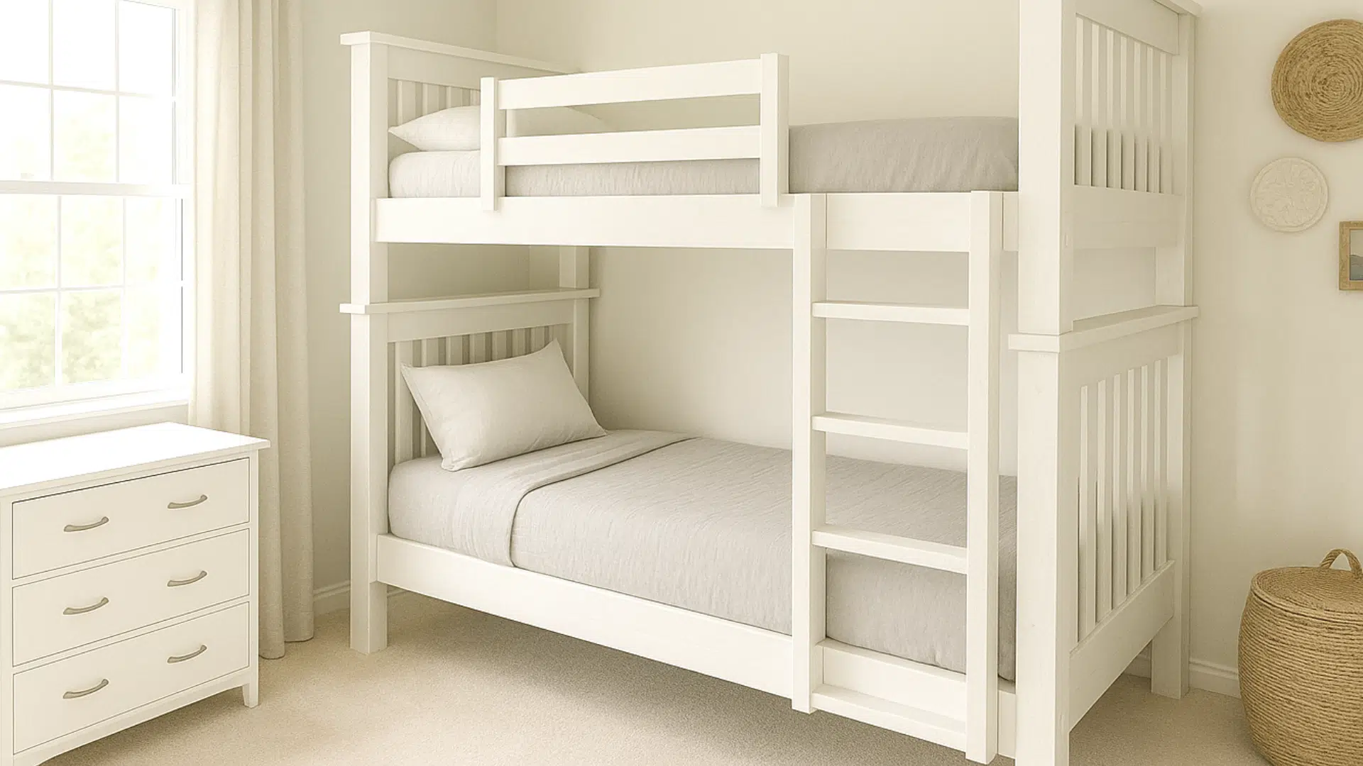

Your bedroom shouldn’t feel like a waiting room that happens to have a duvet. And yet… so many do. Usually because someone (maybe you, maybe Past You who was feeling “bold”) picked a trendy paint color under store lighting that could make a banana look taupe. Paint chips are basically professional catfish.
Also: the direction your bedroom windows face? Annoying how much it matters. A color that looks like “cozy oatmeal” at 2 PM can turn into “sad dentist office” by 8 PM. So let’s talk about the 2025 vibe what I’m calling quietly colorful and how to pick a shade that actually helps you power down at night (and looks good doing it).
The short answer: For 2025, the most sleep friendly picks are low saturation, warm leaning colors (creamy whites, mossy greens, foggy blues, mocha browns) paired with warm, dimmable lighting because light at night tends to affect sleep more than wall color alone [Sleep Foundation, Harvard Health Publishing].
Key exception: If you’re prone to seasonal low mood or you hate dark rooms, go lighter (warm whites, soft sages) and keep the “moody” shades for one wall or textiles.
When it matters less: If you already have blackout curtains and warm bulbs at night, you can relax a bit undertone and light direction will still matter, but you don’t need the “perfect” shade to sleep well [Sleep Foundation].
My motto: Paint should soothe you, not stare at you.
Quick Picks: Top Calm Bedroom Paint Colors for 2025 (Copy Ready)
These are “quietly colorful” winners I’m seeing across 2025 palettes and forecasts aka grounded, warm leaning shades that hold up as daylight fades [Sherwin-Williams Colormix Forecast 2025, Benjamin Moore Color Trends 2025].
- Sherwin-Williams Alabaster (SW 7008) creamy warm white, great for north facing rooms
- Benjamin Moore White Dove (OC-17) soft warm white, flexible with most woods
- Behr Blank Canvas (DC-003) warm neutral white, easy whole room calm
- Sherwin-Williams Evergreen Fog (SW 9130) warm sage, “deep breath” energy
- Benjamin Moore Saybrook Sage (HC-114) classic warm sage, cozy but not heavy
- Farrow & Ball Green Smoke (No. 47) moody sage green/gray, evening friendly
- Farrow & Ball De Nimes (No. 299) foggy denim blue, keeps depth at night
- Benjamin Moore Boothbay Gray (HC-165) soft gray blue, calm without feeling icy
- Benjamin Moore Hale Navy (HC-154) rich navy, cocoon vibe (best with warm lamps)
- Sherwin-Williams Urbane Bronze (SW 7048) brown gray, grown up cozy
- Benjamin Moore Pashmina (AF-100) taupe/mocha greige, warm and grounding
- Farrow & Ball Brinjal (No. 222) aubergine plum, dramatic but plush
Quick comparison table (so you can decide faster)
| Color | Brand / Code | Undertone vibe | Best window light | Room size sweet spot | Pairs well with |
|---|---|---|---|---|---|
| Alabaster | SW 7008 | creamy warm | North / East | Small → Large | warm woods, linen, brass |
| White Dove | BM OC-17 | warm neutral | All (very forgiving) | Small → Large | oak, walnut, black accents |
| Blank Canvas | Behr DC-003 | warm neutral | North / East | Small → Large | beige, greige, soft black |
| Evergreen Fog | SW 9130 | warm sage | West / South | Small (one wall) → Large | caramel, warm white, clay |
| Saybrook Sage | BM HC-114 | warm sage | East / South | Small → Large | rattan, cream, antique brass |
| Green Smoke | F&B No. 47 | smoky green gray | North (with warm bulbs) / West | Medium → Large | oatmeal, tan leather, walnut |
| De Nimes | F&B No. 299 | foggy denim | South / West | Medium → Large | crisp whites, rust, natural wood |
| Boothbay Gray | BM HC-165 | soft gray blue | East / South | Small → Large | white oak, warm whites |
| Hale Navy | BM HC-154 | deep navy | South (best) / East | Medium → Large | white trim, warm metals |
| Urbane Bronze | SW 7048 | brown gray | South / West | Medium → Large | cream, cognac, stone |
| Pashmina | BM AF-100 | mocha greige | North / West | Small (balanced) → Large | warm white trim, flax tones |
| Brinjal | F&B No. 222 | plum aubergine | South / East | Medium → Large | creamy whites, walnut, velvet |
The 2025 Bedroom Trend: “Quietly Colorful” (A.K.A. Calm With a Personality)
The big shift right now is away from icy, sterile whites that can make a bedroom feel a little… clinical. In 2025, the colors that are winning are the ones that look good as daylight fades because, hi, you live in your room at night too [Sherwin-Williams Colormix Forecast 2025, Benjamin Moore Color Trends 2025].
Think warm, grounded undertones: plum browns, mossy greens, foggy blues, creamy whites. They feel substantial, like your room is wearing a cozy hoodie. Not “blank canvas minimalist museum” energy. (Unless that’s your thing. Truly no judgment.)
The Sleepy Time Color Shortlist (My Favorites + Who They’re For)
I’m going to keep this practical. Here are the colors I’m seeing everywhere and more importantly, why you’d choose them.
1) Cinnamon Slate + Rich Mocha Browns (Cozy, Grown Up, Slightly Moody)
If you want a bedroom that feels like a boutique hotel where someone brings you a croissant (in my dreams), these are your people.
This whole plum brown / mocha family reads warm and rich especially once your lamps are on. Darker, low saturation colors also tend to feel visually “quieter” at night for a lot of people, particularly when you keep lighting warm and dim [Sleep Foundation, Harvard Health Publishing].
Try these (2025 friendly moody browns):
- Benjamin Moore Pashmina (AF-100) warm mocha greige, flexible in mixed light
- Sherwin-Williams Urbane Bronze (SW 7048) brown gray, cozy without going orange
- Farrow & Ball Brinjal (No. 222) aubergine/plum drama (best in rooms with decent daylight)
Small room note: If your room is tiny and you don’t have great lighting, go dark only if you’re ready to commit to the whole vibe (good lamps, lighter bedding, and ideally a ceiling that doesn’t glow cold white). Dark paint is like bangs you can do it, but it behaves better with a little styling and small room styling tricks.
If you deal with seasonal low mood: Consider keeping walls mid to light (warm white, soft sage) and using moody browns in textiles or one wall, so the room still feels bright on short winter days.
2) Warm Whites (For When You Want “Calm” Without Picking a Whole New Personality)
Warm white is the unsung hero of bedrooms. Not the cold “builder basic” white more like a soft cream leaning white that feels candlelit.
This is perfect if:
- your bedroom is small,
- you’re renting,
- your room is north facing and naturally chilly,
- you change bedding a lot and don’t want to fight your walls every season.
Try these warm whites:
- Sherwin-Williams Alabaster (SW 7008) creamy and soft, flattering in cooler rooms
- Benjamin Moore White Dove (OC-17) warm neutral, plays nicely with most trim
- Behr Blank Canvas (DC-003) warm neutral white, easy whole room choice
Warm white gives you peace without being boring. And yes, it still counts as a color choice.
3) Restorative Greens (The Deep Breath Color)
Green is still the queen of “ahhh” bedrooms, but we’re moving away from minty cool greens and into warm sages and mossy olives.
This neighborhood can feel grounding fast especially in the evening, when a green that leans warm stays cozy instead of going gray blue.
Try these restorative greens:
- Sherwin-Williams Evergreen Fog (SW 9130) warm sage, very “quietly colorful”
- Benjamin Moore Saybrook Sage (HC-114) classic warm sage, timeless in bedrooms
- Farrow & Ball Green Smoke (No. 47) smoky and moody, gorgeous with warm lamps
Tiny cheat sheet because green can be sneaky:
- Cool gray greens are airier in small rooms, but can look chilly in north light.
- Warm olives/moss are richer and cozier… but can go weird under the wrong bulb.
Pair green with caramel, beige, warm white, or natural wood for warm inviting bedroom touches. And if you’re building a sleep friendly setup, keep nighttime lighting warm and dim (color temperature and brightness tend to matter more to sleep than wall color alone) [Harvard Health Publishing, Chang et al., 2015].
If you get migraines or feel sensory overloaded easily: Favor low contrast palettes (soft trim, fewer sharp black accents) and skip shiny sheens glare can be surprisingly activating.
4) Calming Blues (Classic for a Reason, Just Pick the Right One)
Blue gets hyped as a sleep color because many people experience it as visually “cooler” and quieter. That said: not all blues behave, and your lighting is the real boss here.
- Light blues can wash out in low light and look… kind of nothing.
- Foggy, gray blues keep their depth into evening, which is what you want in a bedroom.
- Navy is gorgeous if you like a cocoon feel especially in rooms with decent daylight or warm lamps.
Try these blues:
- Farrow & Ball De Nimes (No. 299) denim fog perfection for evenings
- Benjamin Moore Boothbay Gray (HC-165) soft gray blue that doesn’t go icy fast
- Benjamin Moore Hale Navy (HC-154) deep, classic navy, best with warm white trim
If your brain runs a nightly highlight reel of everything you’ve ever said since 2009, a muted blue can be a solid “please hush” backdrop.
5) Bright Accents (Yes, You Can Have Fun Just Don’t Turn the Room On High)
Bedrooms need a little boundary setting. Bright colors are like caffeine: delightful, but not at 9 PM.
If you love yellow, go for buttery or mustard tones but keep them to accents (pillows, art, a throw, a lamp). Full yellow walls can feel like your room is shouting “GOOD MORNING” when you’re trying to become one with your mattress.
Reds? Same deal, but more intense. I like red as an accent behind a headboard or in textiles think muted, brown leaning reds or burgundies, not “tomato festival.”
Goal: cozy, not chaotic.
Before You Commit: Your Bedroom Light Will Make or Break This
I know, I know. You want to pick a color and be done. But your window direction is about to have an opinion.
Here’s the simplest version:
- North facing: cool, blue gray light all day. Choose warm whites, warm neutrals, earthy tones. Be careful with cool greens.
- South facing: lots of warm light. You can pull off deeper colors and complex blues beautifully.
- East facing: bright ish in the morning, cooler later. Warm neutrals and gentle warm colors are super flattering here.
- West facing: warm, intense afternoon light. Soft greens and cooler leaning blues help balance that glow.
If you’ve ever painted a room and thought, “Why does this look like a completely different color at night?” yep. This is why.
Sleep friendly lighting note: If you’re serious about winding down, prioritize warm, dimmable bulbs at night and reduce bright light in the hour or two before bed light timing and intensity can influence circadian rhythm and melatonin more directly than wall color does [Harvard Health Publishing, Chang et al., 2015].
Small Room vs. Big Room: Pick a Shade That Fits the Space
This part matters more than people think.
- Small bedrooms: lighter colors usually keep things feeling open. But if you want moody? Do it. Paint the ceiling the same color for a cocoon effect and suddenly it feels intentional, not cramped.
- Large bedrooms: deeper colors can make the space feel less like an echo y beige hotel ballroom. Darker shades can help a big bedroom feel more intimate.
Translation: match the drama level to the room size, and you’ll almost always like the result more.
Sheen Matters (Because Walls Can Go From “Velvety” to “Roller Fight” Real Fast)
If you want the easiest, nicest finish for bedroom walls: eggshell. It’s the sweet spot soft, not shiny, and it cleans up decently.
- Matte is gorgeous and forgiving on imperfect walls… but scuffs easily.
- Satin is better for trim/doors. On big walls it can look too shiny and highlight every bump, patch, and questionable drywall moment.
Don’t Skip Testing the Paint (Seriously. Do Not.)
If you take nothing else from this post, take this: don’t choose paint from a chip alone. Undertones love to reveal themselves dramatically after you’ve already painted the whole room and told everyone you’re “basically done.”
Do this instead:
- Paint a big sample patch (at least 12×12, bigger if you can).
- Use two coats.
- Use the same finish you plan to paint the room with.
Then watch it for a couple days:
- Morning: sneaky pink/green undertones show up
- Midday: full brightness reality check
- Evening: warm shifts (yellow/orange) come out to play
- Night: your bulbs take over
This is how you avoid accidentally creating a lavender surprise when you were aiming for “calm gray.”
Best Trim + Ceiling Whites (So Your Wall Color Doesn’t Look “Off”)
Trim is where a lot of “why does this feel weird?” comes from. Pick a trim white that matches your wall undertone:
- Warm walls (sage, mocha, creamy whites):
- BM White Dove (OC-17) warm neutral, very flexible
- SW Alabaster (SW 7008) soft and creamy
- Neutral to cool walls (foggy blues, gray blues):
- SW Pure White (SW 7005) clean without looking icy
- BM Chantilly Lace (OC-65) crisp and bright (best if your light isn’t too cold)
Ceiling tip: Most people like a flat/matte ceiling in a white that’s either the same as the trim or slightly brighter unless you’re intentionally color drenching for that cozy cocoon.
Who Should Be Careful (Quick Notes)
- If you have asthma/chemical sensitivities (or you’re just smell sensitive): Look for low/zero VOC options and ventilate well during and after painting indoor paint fumes can irritate airways for some people [U.S. EPA].
- If you’re a shift worker sleeping in daylight: Wall color helps, but blackout curtains and strict light control usually matter more for sleep timing [Sleep Foundation].
- If you get migraines or light sensitivity: Avoid glossy sheens and harsh contrast. Glare and high visual “noise” can be triggering.
- If you’re dealing with ongoing insomnia or anxiety: Treat color as support not the whole solution. A consistent wind down routine and light management tend to have more evidence behind them than any specific paint shade [AASM].
Frequently Asked Questions
What bedroom paint color is most relaxing for sleep?
Most people find low saturation, warm leaning colors (creamy whites, soft sages, foggy blues, warm taupes) easier to live with at night. That said, sleep is usually influenced more by light exposure, temperature, noise, and routine than by wall color alone [Sleep Foundation].
What are the best bedroom paint colors for 2025?
For 2025, “quietly colorful” shades are leading: warm whites, mossy sages, denim like blues, and mocha browns. Those families show up repeatedly across major brand forecasts and trend palettes [Sherwin-Williams Colormix Forecast 2025, Benjamin Moore Color Trends 2025].
When should I look at paint samples before choosing a bedroom color?
Check samples in the morning, midday, evening, and at night with your actual lamps on. Undertones can shift a lot as natural light fades and artificial light takes over.
Is navy too dark for a small bedroom?
Not necessarily navy can look amazing in a small room if you like a cocoon feel and you balance it with warm lighting and lighter bedding. If you’re unsure, try navy on just the headboard wall first.
Are there any risks to painting a bedroom right before sleeping in it?
Fresh paint odor and fumes can bother some people, especially those with asthma or sensitivities. Consider low/zero VOC paint and give the room time to ventilate well before sleeping there [U.S. EPA].
Is “sleepy” paint color as important as bedroom lighting?
Lighting usually matters more. Bright and/or blue leaning light in the evening can delay sleepiness for some people, so warm, dim light at night is often the bigger win [Harvard Health Publishing, Chang et al., 2015].
When should I talk to a doctor about sleep problems instead of changing my room?
See a healthcare provider if insomnia lasts more than 3 weeks, if you regularly snore loudly or wake up gasping/choking, or if daytime sleepiness is affecting your safety (driving, work, school) [AASM].
My Final Take
The best bedroom colors don’t perform for social media. They support your wind down. They make you exhale when you walk in. They fade into the background in the best way like a soft blanket for your eyes.
So pick a shade that feels good in your light, in your room, at the hour you actually go to bed… and then go paint that test square like a responsible adult. (I’ll be over here staring at my own sample patches like they’re mood rings.)
Now go paint that square and let your walls tell you the truth.
Sources
- Sleep Foundation. “How to Create the Ideal Sleep Environment.” (overview)
- Harvard Health Publishing (Harvard Medical School). “Blue light has a dark side.” (overview)
- Chang, A.-M. et al. “Evening use of light emitting eReaders negatively affects sleep, circadian timing, and next morning alertness.” PNAS, 2015. (clinical trial)
- American Academy of Sleep Medicine (AASM). “Clinical practice guideline for the pharmacologic treatment of chronic insomnia in adults.” Journal of Clinical Sleep Medicine, 2017. (guideline)
- U.S. Environmental Protection Agency (EPA). “Volatile Organic Compounds’ Impact on Indoor Air Quality.” (overview) https://www.epa.gov/indoor-air-quality-iaq/volatile-organic-compounds-impact-indoor-air-quality
- Sherwin-Williams. “Colormix Forecast 2025.” (trend report)
- Benjamin Moore. “Color Trends 2025.” (trend report)