Walk into a room with beautiful colors and stylish furniture, and it still feels flat. Lifeless. The missing piece? Texture in interior design.
Color sets the mood, but texture creates the experience. It’s what makes a space feel like an actual home instead of a catalog page.
The rough grain of wood, the soft sink of linen, the cool smoothness of marble, these details make rooms feel rich and complete.
This guide explains what texture actually is, why it matters more than most realize, and how to layer it without overthinking.
You’ll learn the two main types, where to add texture easily, common mistakes to avoid, and practical swaps that work in any room. No theory, just what actually changes spaces.
The 2 Main Types of Texture and How They Work
Texture shows up in two distinct ways in any room. Understanding both helps create depth instead of randomness.
A) Tactile Texture – What You Can Touch
This is physical surface quality. It affects how comfortable and inviting a space feels. Some common examples are:
- Soft: velvet, linen, cotton bedding, faux fur, boucle upholstery
- Rough: jute rugs, raw wood, exposed brick, sisal, concrete
- Smooth: leather, polished stone, lacquered furniture, glass
Tactile texture does the heavy lifting for comfort. A room needs at least 2-3 soft tactile textures or it feels cold.
B) Visual Texture – What Looks Textured
This creates interest through pattern, finish, or material appearance, even when the surface is smooth. Some common examples are:
- Wallpaper with embossed or printed texture
- Veined marble or granite
- Wood grain (even when sealed smooth)
- Ribbed or fluted surfaces on furniture/decor
- Woven or cross-hatch patterns on fabrics
Many items have both. A chunky knit throw is tactile (soft, bumpy) and visual (shows the weave pattern). Texture has size. Large-scale textures (wide wood planks, chunky knits, oversized tiles) make bold statements.
Fine textures (smooth linen, delicate caning, small mosaics) add subtlety. Mix both or the room feels monotonous.
Pattern ≠ Texture (but they work together) A smooth pillow with geometric stripes = pattern, not texture. A solid-color linen pillow with visible weave = texture. A nubby fabric with printed florals = both. Don’t confuse the two when layering.
How to Layer Texture in Your Space
Layering texture means building depth through three levels: base textures (large foundational pieces), supporting textures (medium items), and accent textures (small finishing touches).
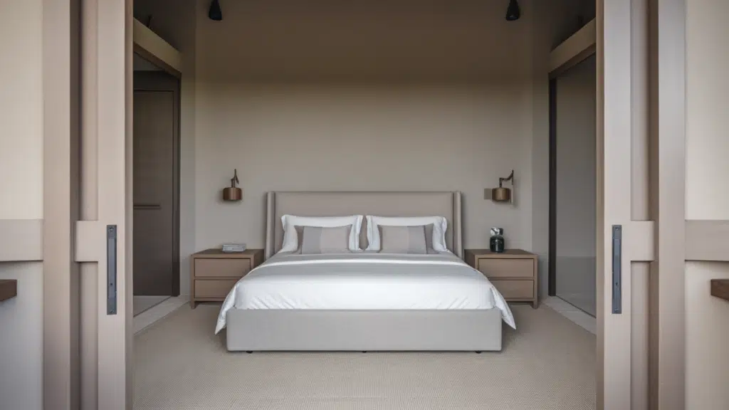
1. Floors: Foundation Texture That Anchors Everything
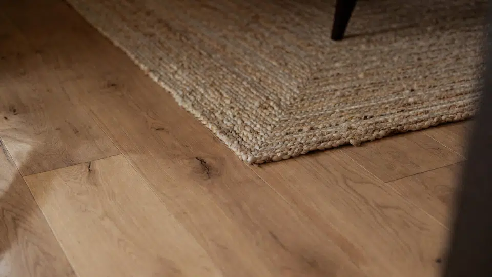
Flooring is your base texture; it sets the tone before anything else enters the room. Hardwood, tile, concrete, or carpet each brings distinct tactile and visual qualities.
Layer a rug over hard flooring to add warmth and define zones. Jute or sisal rugs introduce rough, natural texture. Plush wool or shag adds softness underfoot.
A patterned flatweave provides visual texture without bulk. The floor is where texture layering starts, so choose materials that complement rather than compete with what comes next.
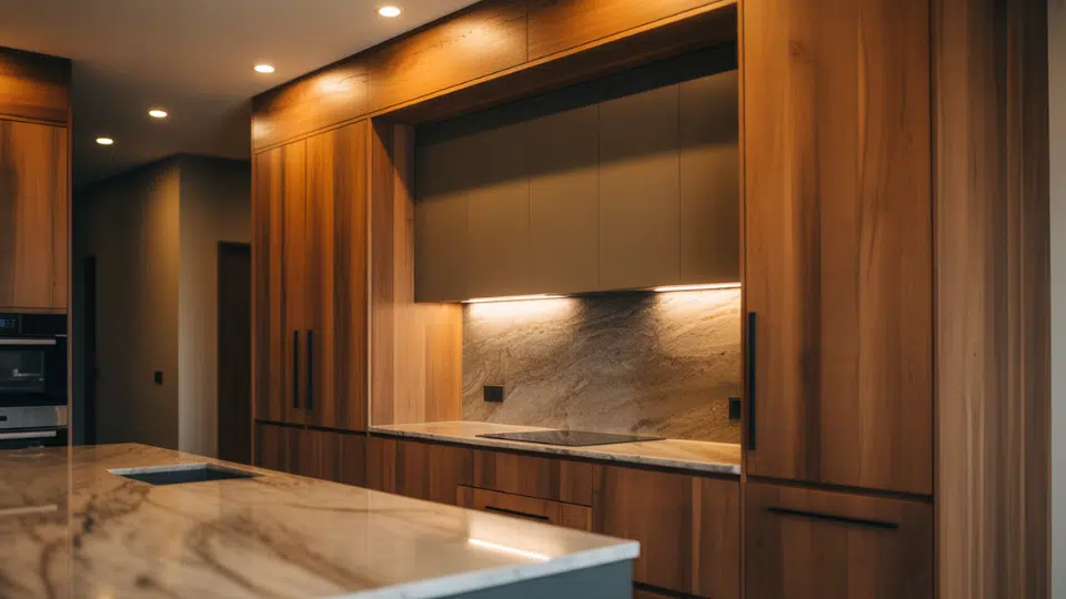
2. Walls: Vertical Surfaces That Create Drama
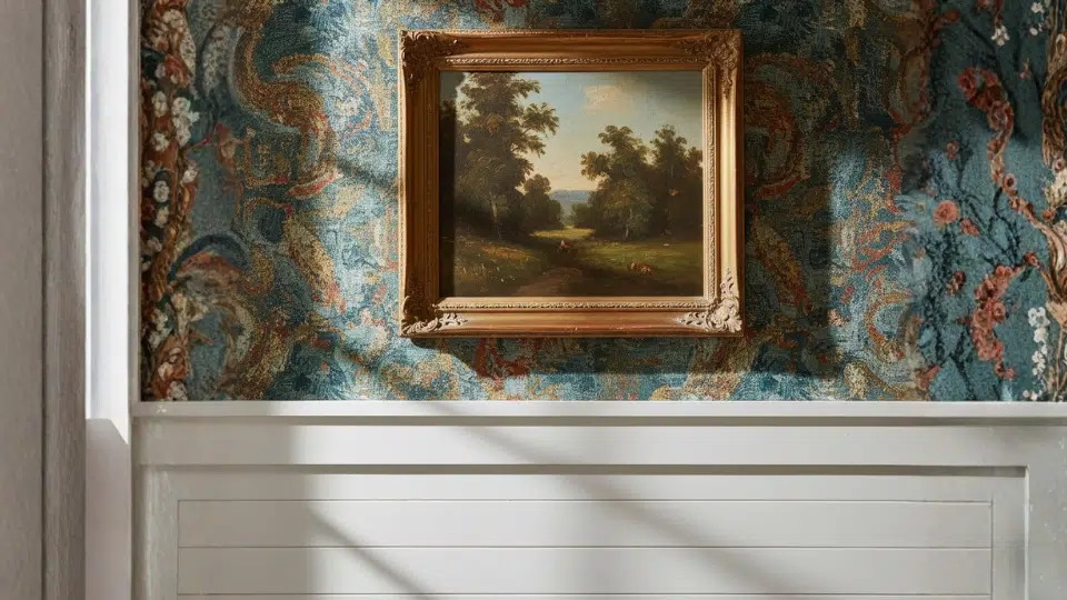
Walls are massive opportunities for both visual and tactile texture. Smooth paint is fine, but it’s the easiest place to go flat.
Add dimension with textured wallpaper, board-and-batten paneling, or limewash and plaster finishes that catch light differently throughout the day. Shiplap, brick, or stone create architectural texture.
For anyone leaning into that more architectural look, it also helps to study how different surface materials change the feel of a room before making a final choice. Looking at brands like I-XL, along with options such as Cultured Stone, Eldorado Stone, or Coronado Stone, can be useful at this stage, especially when comparing finishes that bring stronger visual texture to walls and other fixed surfaces.
That kind of detail can make a space feel more grounded, layered, and less dependent on decor alone. It also gives you a clearer sense of how stone-inspired finishes might work with the rest of the room’s materials and color palette. In many cases, even one textured surface can shift the whole room from feeling flat to feeling more considered.
Even artwork adds visual texture; an oil painting with thick brushstrokes versus a smooth photograph changes the room’s character. Walls act as a supporting texture that frames everything else, so don’t leave them blank and boring.
3. Furniture: Where Comfort Meets Material Choice
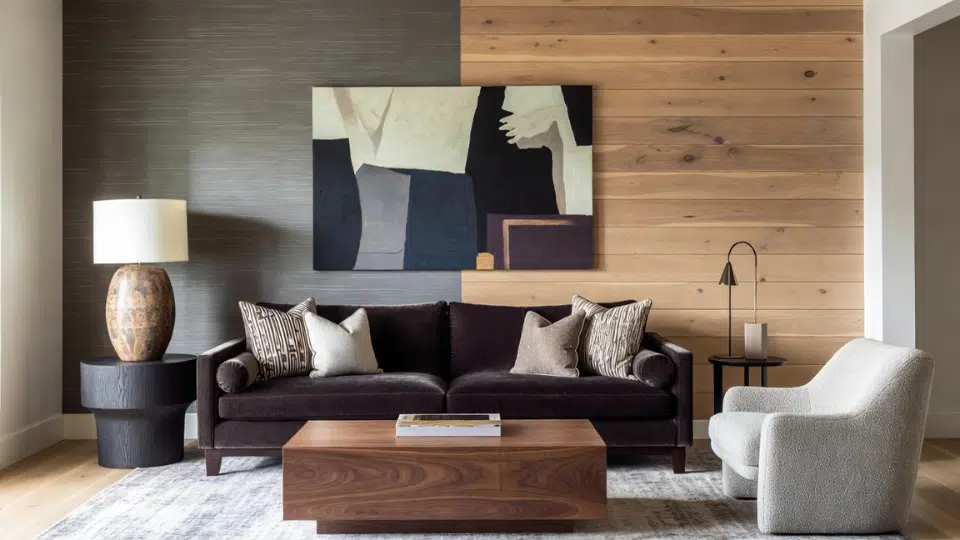
Furniture provides both base and supporting texture, depending on size. Your sofa is a base texture; choose upholstery that feels good and looks intentional.
Linen breathes and wrinkles beautifully. Velvet adds luxury and light play. Leather ages and develops patina. Boucle offers chunky, tactile appeal.
Mix furniture materials: a smooth wood coffee table against a textured sofa, cane or rattan chairs near upholstered seating. Wood grain itself is a visual texture; compare sleek walnut to rough reclaimed pine. Every furniture piece is a textural decision.
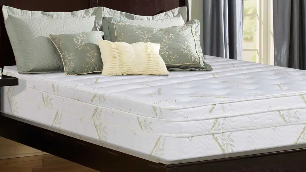
4. Soft Furnishings: Tactile Layers You’ll Actually Touch
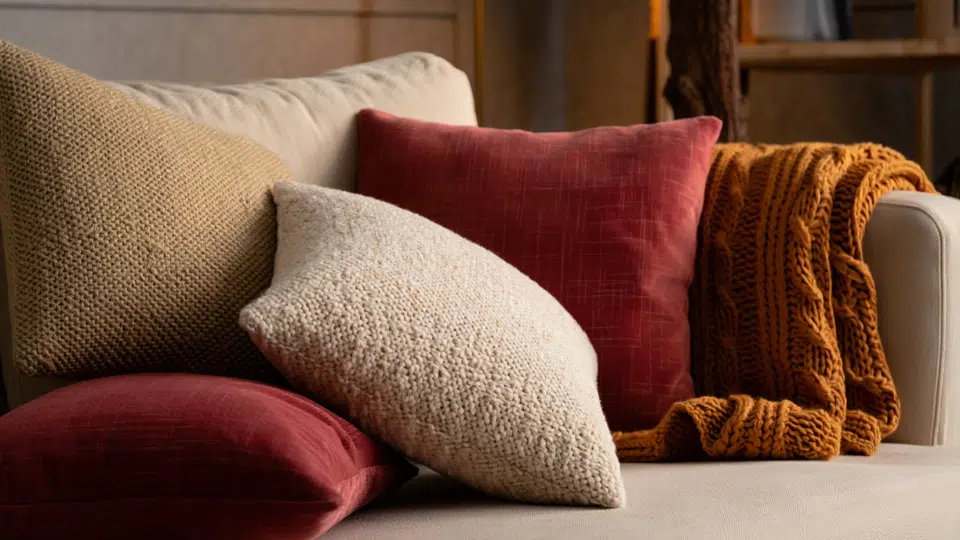
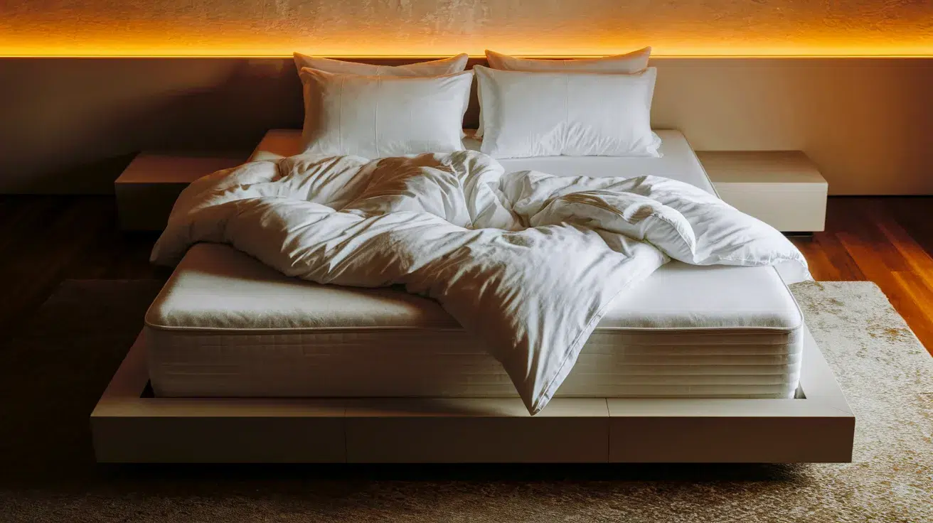
Pillows, throws, and bedding are accent textures that make rooms feel lived-in and inviting. This is where you add softness and comfort. Layer a chunky cable-knit throw over smooth linen sheets.
Mix pillow textures: one boucle, one velvet, one linen. In bedding, combine crisp cotton sheets with a textured quilt and chunky knit blanket at the foot.
These are the textures you interact with daily, so prioritize how they feel. Swap seasonally, lightweight cotton in summer, heavier wool and faux fur in winter.
5. Window Treatments: Framing With Fabric Weight
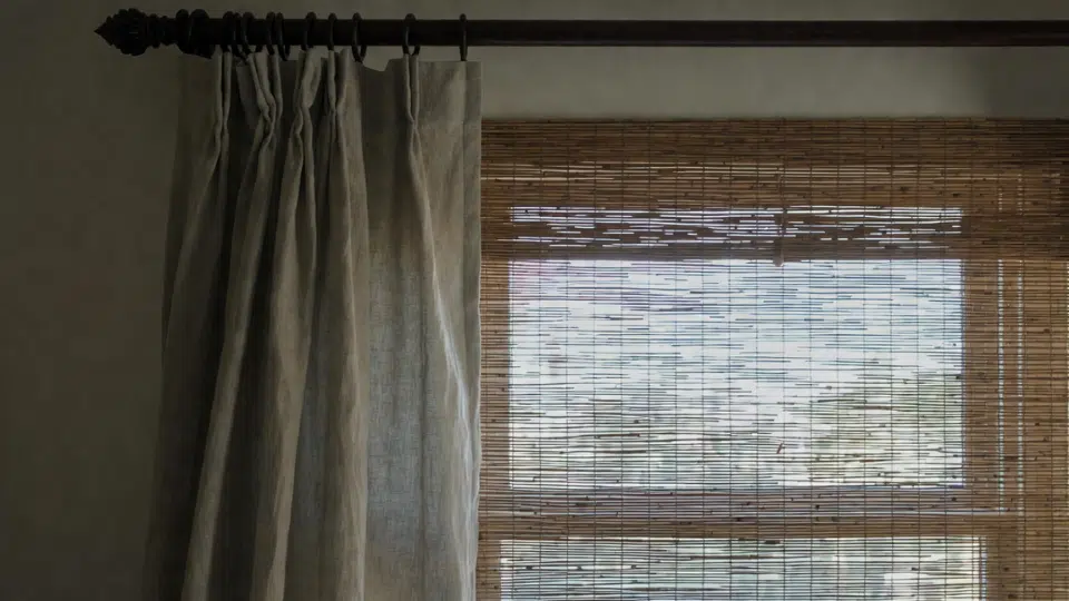
Curtains and blinds are supporting textures that soften hard edges and control light. Heavy linen or velvet drapes add weight and formality.
Sheer cotton or gauze creates airiness. Woven bamboo or matchstick blinds introduce natural, visual texture. The key is fabric weight and how it drapes; stiff versus flowing changes the room’s feel entirely.
Layer sheers under heavier curtains for depth. Avoid overly smooth synthetic fabrics; they lack the tactile interest that makes window treatments worth the investment. Texture here softens architecture.
6. Decor & Accessories: Small Touches With Big Impact
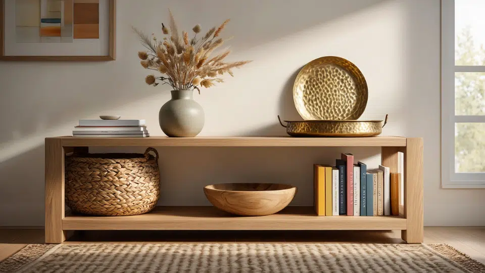
Accessories are accent textures that finish a room. Woven baskets replace plastic bins and add organic warmth. Ceramic vases, wood bowls, and hammered metal trays each introduce a different surface quality.
Books on shelves add paper texture and visual weight. Glass and crystal reflect light (smooth, glossy). Stone and concrete feel substantial and grounded.
The rule: don’t cluster all one texture together. Mix materials on a console table, wood, ceramic, metal, so the eye travels and discovers variety instead of sameness.
7. Plants & Greenery: Organic Texture That Breathes Life
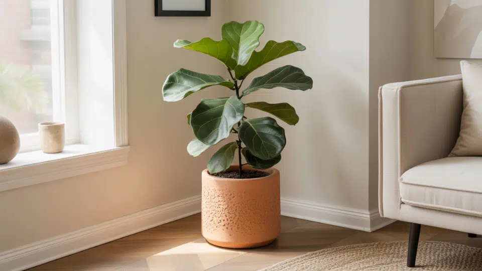
Plants are often overlooked as texture, but they’re powerful visual and tactile additions. Glossy fiddle-leaf fig leaves contrast with matte monstera.
Wispy ferns feel delicate; spiky snake plants feel architectural. Even the pot matters; a rough terracotta planter reads differently than smooth ceramic or woven seagrass.
Real plants beat fakes for texture because they move, grow, and change. If real isn’t realistic, choose high-quality faux plants in textured planters. Greenery adds an organic layer that makes spaces feel alive and less staged.
8. Lighting: How Fixtures and Light Itself Add Depth
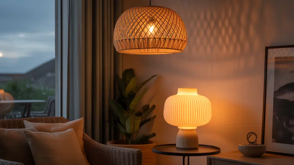
Lighting works two ways. First, the fixture itself is texture, a ribbed ceramic lamp base, a hammered brass sconce, or a woven pendant shade, each of which contributes material variety.
Second, the light quality creates texture: warm light softens spaces and makes textures feel cozy; cool light sharpens details and can feel harsh. Matte surfaces absorb light; glossy surfaces reflect it.
Rough textures cast shadows that add dimension. Layer lighting at different heights, table lamps, floor lamps, pendants, so that light and shadow create textural depth throughout the room.
Common Texture Mistakes in Interior Design
Even with good intentions, texture can go wrong. Here are the most common missteps and how to correct them fast.
| Mistake | Quick Fix |
|---|---|
| Using all matte or glossy finishes makes rooms feel flat and one-dimensional. | Add contrast by pairing shiny elements (glass, lacquer, metal) with matte surfaces (linen, matte paint, unglazed ceramic). Balance is key. |
| Too many textures and eight materials in one room create visual chaos and a lack of depth. | Maintain a unified color palette, use 4-5 textures, and repeat favorites in different forms. |
| Avoid soft textures; hard surfaces like leather, wood, metal, and stone make spaces feel cold and unwelcoming. | Add at least two soft textures per room, like throws, rugs, cushions, or upholstered pieces. Softness equals comfort. |
Texture mistakes are fixable. Start small, add one contrasting element, and notice how quickly the room starts feeling more complete.
Final Thoughts
Mastering texture in interior design doesn’t require a complete room overhaul or expensive purchases. It’s about understanding the difference between tactile and visual texture, then layering both intentionally across floors, walls, furniture, and accessories.
I’ve shared eight practical ways to add texture, like swapping smooth curtains for linen and choosing lighting that adds dimension.
The aim isn’t perfection but creating warm, authentic spaces. Start small: add a chunky throw or replace plastic organizers with woven baskets. Notice how one change changes the feel.
Texture changes rooms from looking styled to feeling finished. That’s the difference worth making. What texture are you adding first? Drop a comment below or find more design guides to keep building your space.